flowchart TD
    A[Goal: share data interactively] --> B{Does it need<br>reactivity from R?}
    B -- Yes --> C[Shiny or<br>Dashboard + Shiny]
    B -- No --> D{Is a card-based layout<br>with browser widgets enough?}
    D -- Yes --> E[Quarto Dashboard<br>static]
    D -- No --> F[Shiny app]
    E --> G[Easy to build<br>Host anywhere -- no server needed]
    C --> H[Requires Posit Connect Cloud<br>or shinyapps.io]
    F --> H
NoteAcknowledgments
This lesson draws from the Quarto Dashboards documentation, and uses data from the Yolo Bypass Fish Monitoring Program, collected by the Interagency Ecological Program.
1 Overview
Using Shiny, you can build fully reactive apps powered by a live R server. Sometimes, though, you want something easier to build and share. Imagine a dashboard layout with basic interactive charts and tables, rendered once and published as a static web page. That is exactly what Quarto Dashboards offer.
In this session, we will build a monitoring dashboard for the Yolo Bypass fish dataset from scratch. By the end, you will have a multi-page, themed, interactive dashboard and know how to publish it.
ImportantQuarto version requirement
Quarto Dashboards require Quarto 1.4 or later. Check your version by running quarto check in the terminal. Download the latest version at quarto.org/docs/download.
2 Where Dashboards Fit
At a high level, here is where Quarto Dashboards fit into the data product landscape:
| Product | What it is | Interactivity |
|---|---|---|
| Script or notebook | R code rendered once | None (static output) |
| Quarto document | Reproducible report as HTML or PDF | None (static output) |
| Quarto doc + widgets | Same, with JS-based widgets embedded | Limited (hover, zoom, sort on pre-rendered data) |
| Quarto Dashboard | Card-based layout with JS widgets | Limited (same browser-side interactivity, in a purpose-built layout) |
| Quarto Dashboard + Shiny | Dashboard layout with a live R server | Full (users control computations) |
| Shiny app | Standalone reactive application | Full (users control everything) |
Dashboards occupy a sweet spot: they look like dashboards and support a rich layout, but require no server to host. Interactive charts (Plotly) and tables (DT) run entirely in the reader’s browser.
When to use a dashboard vs. Shiny
Real-world examples
- New Zealand Earthquakes – spatial data with interactive map
- Housing Market at a Glance – multi-page layout with value boxes and maps
- Diamonds Data – adds Shiny inputs for full reactivity
3 Dashboard Anatomy
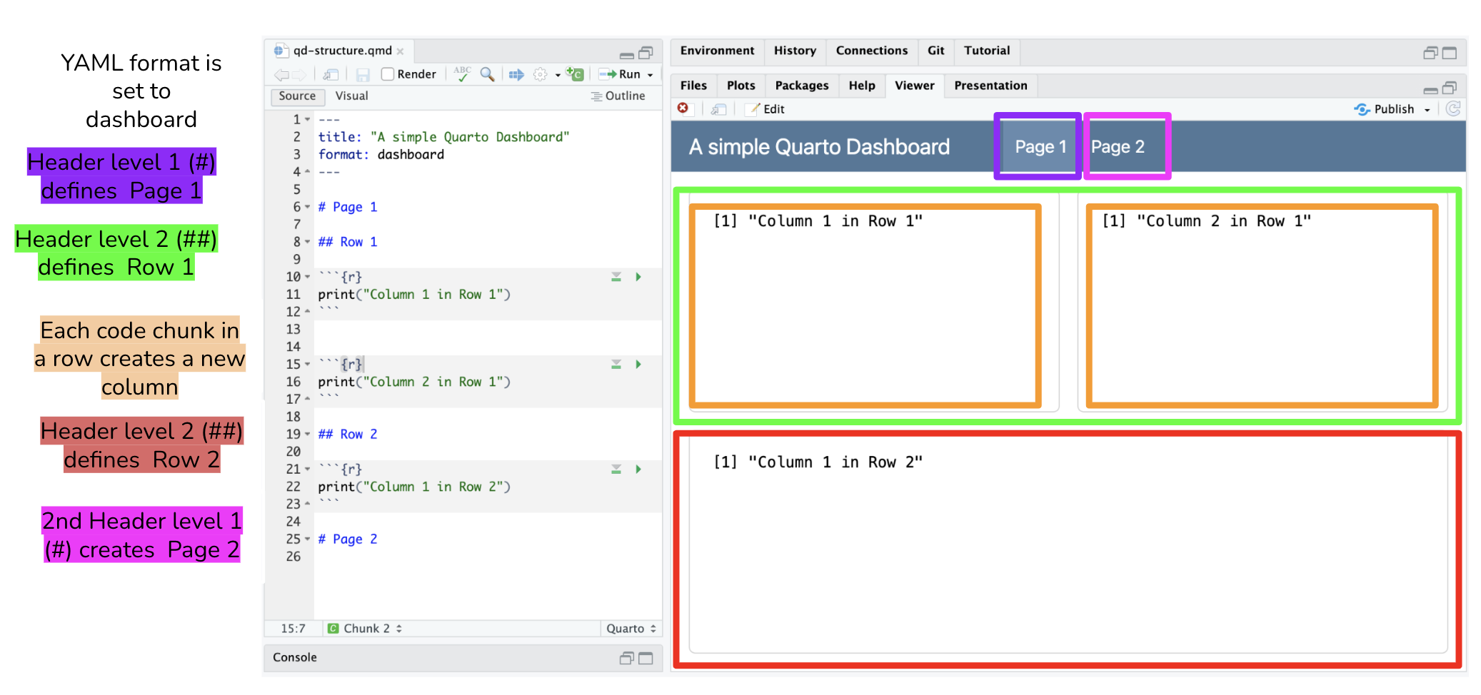
A Quarto Dashboard is a .qmd file with format: dashboard in its YAML header. Everything else uses the Quarto markdown you already know, but now the heading hierarchy takes on a special meaning for layout:
| Markdown | Dashboard meaning |
|---|---|
# Level 1 heading |
A new page (shown in the navigation bar) |
## Level 2 heading |
A new row (within a page) |
| Code chunk | A card (column within the current row) |
Setting up the YAML
Like any Quarto document, we need a YAML header specifying metadata and options. For a dashboard, the only required option is format: dashboard.
Here is an example of minimum YAML for a dashboard:
---
title: "My Dashboard"
format: dashboard
---
And here is more complete YAML with theming, which we’ll discuss more later:
---
title: "Delta Fish Monitoring"
author: "Your Name"
format:
  dashboard:
    theme: cosmo
    orientation: rows
---
orientation: rows is the default (so ## headings create rows). Setting orientation: columns flips it so ## headings create columns.
Layout attributes
Control relative sizes by adding attributes to headings:
## Row {height="30%"}

## Row {height="70%"}
Create tabsets within a row with the .tabset class:
## Row {.tabset}
TipHeading text is discarded
Dashboard headings define layout only. The heading text itself (e.g., Row in the examples above) is not displayed in the rendered output. Use whatever text helps you navigate your source code.
Here is a quick reference for some useful layout attributes:
| Attribute | Where to use | Effect |
|---|---|---|
{height="30%"} |
## row heading |
Sets relative row height on the page |
{width="40%"} |
### column heading |
Sets relative column width within a row |
{.tabset} |
## row or ### column |
Converts cards into tabs |
{.sidebar} |
## heading |
Creates an input sidebar (for Shiny integration) |
{.hidden} |
# page heading |
Excludes a page from the navigation bar |
orientation: columns |
YAML | Makes ## headings into columns instead of rows |
4 Dashboard Components
Value Boxes
Value boxes display a single key metric with a title, icon, and color. They are a natural fit for summary statistics at the top of a dashboard.
Use the #| content: valuebox chunk option and return a named list() with three fields:
list(
  icon = "binoculars",
  color = "primary",
  value = 4
)icon: a Bootstrap Icon name – search the gallery by keyword (e.g.,"water","binoculars","bar-chart")color: a Bootstrap role (primary,secondary,success,info,warning,danger) or a hex string like"#2C7BB6"value: any R object rendered as text – a number, formatted string, etc.
TipCustom icons
Bootstrap Icons covers 2,000+ icons; searching by keyword (try “water”, “arrow-up-circle”, “clipboard-data”) finds something usable in most cases. If you genuinely need a custom image or agency logo, you can pass an SVG string via htmltools::HTML('<svg ...>...</svg>') as the icon value – see the value box documentation for details and caveats.
Interactive Charts
Any R graphics output works as a dashboard card, including ggplot2, base R, and lattice. For interactive charts, plotly is the simplest option: ggplotly() converts any ggplot2 plot into an interactive Plotly chart.
library(ggplot2)
library(plotly)
p <- ggplot(fish, aes(x = SampleDate, y = Secchi)) +
geom_point(color = "steelblue", alpha = 0.4) +
labs(x = "Date", y = "Secchi depth (m)") +
theme_light()
ggplotly(p)- 1
-
ggplotly()wraps any ggplot – no other changes needed
Interactive Tables
Use DT::datatable() for interactive, sortable, searchable tables:
library(DT)

catch_summary %>%
  datatable(
    rownames = FALSE,
    options = list(pageLength = 10)
  )
For simple static tables, knitr::kable() works fine and renders faster.
5 Building a Dashboard
Now let us build a Delta Fish Monitoring dashboard from scratch using the Yolo Bypass dataset.
Setup: Create the file
- Go to File → New File → Quarto Document and save it as
delta-dashboard.qmdin your project folder. - Replace the default YAML with the dashboard YAML below.
- Go to File → New File → Quarto Document…, give it a title, click Create, and save as
delta-dashboard.qmd. - Replace the default YAML with the dashboard YAML below.
Start with this YAML at the top of the file:
---
title: "Delta Fish Monitoring"
format:
  dashboard:
    theme: cosmo
---
Then add a chunk right after the YAML to load packages. Here we use a hash-pipe label option to label this chunk. The label will not be appear in the dashboard output, but it enables automatic outline-based navigation of your document in IDEs like Positron.
```{r}
#| label: load packages

library(readr)
library(dplyr)
library(lubridate)
library(plotly)
library(DT)
```
Next add a chunk for loading data. Rather than simply loading from the URL, we apply an if/else caching pattern to download the data file only if it hasn’t already been locally cached.
```{r}
#| label: load data

# Set paths
yolo_catch_url <- "https://pasta.lternet.edu/package/data/eml/edi/233/2/015e494911cf35c90089ced5a3127334"
data_dir <- "data"
yolo_catch_file <- file.path(data_dir, "yolo_catch.csv")

# Download data if not already cached
if (!file.exists(yolo_catch_file)) {
  message("Downloading file...")
  dir.create(data_dir, showWarnings = FALSE, recursive = TRUE)
  download.file(
    url = yolo_catch_url,
    destfile = yolo_catch_file
  )
  message("Saved to: ", yolo_catch_file)
} else {
  message("Using cached file.")
}

# Load the (locally cached) data
fish <- read_csv(yolo_catch_file, guess_max = 100000) %>%
  mutate(SampleDate = mdy(SampleDate)) %>%
  filter(grepl("Salmon|Striped Bass|Smelt|Sturgeon", CommonName))
```
TipTip: render early and often
After each incremental change to the Quarto document, render the file (Ctrl/Cmd+Shift+K or the Render button) and open the result in a browser to see the layout take shape. Catching layout issues early is much easier than debugging them at the end!
Step 1: Add a page and value boxes
After the setup chunk, add a Level 1 heading to create the first page, a row heading with a height attribute, and three value box chunks:
# Summary

## Row {height="25%"}

```{r}
#| content: valuebox
#| title: "Species Monitored"
list(icon = "binoculars", color = "primary",
     value = n_distinct(fish$CommonName))
```

```{r}
#| content: valuebox
#| title: "Years of Data"
list(icon = "calendar3", color = "success",
     value = n_distinct(year(fish$SampleDate)))
```

```{r}
#| content: valuebox
#| title: "Total Observations"
list(icon = "table", color = "info",
     value = nrow(fish))
```
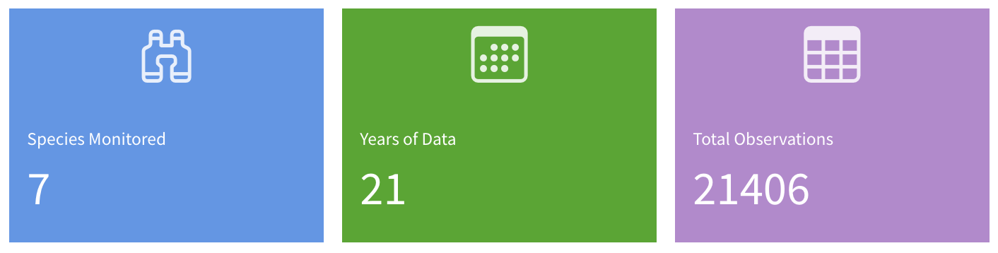
The # heading creates a “Summary” page in the navigation bar. Three code chunks in the same row produce three side-by-side columns automatically.
Note
height is relative, not absolute
{height="25%"} sets the proportion of vertical space this row gets relative to other rows on the same page. With only one row defined so far, it expands to fill the whole screen – that is normal. The height constraint only takes effect in Step 2 once a second row exists to share the space with.
Render the file. You should see a single page with three value boxes filling the screen.
Step 2: Add an interactive chart
Add a second row below the value boxes with a Plotly time series:
## Row {height="75%"}

```{r}
#| title: "Water Clarity Over Time"
p <- fish %>%
  ggplot(aes(x = SampleDate, y = Secchi)) +
    geom_point(color = "#2C7BB6", alpha = 0.4) +
    labs(x = "Date", y = "Secchi depth (m)") +
    theme_light()

ggplotly(p)
```
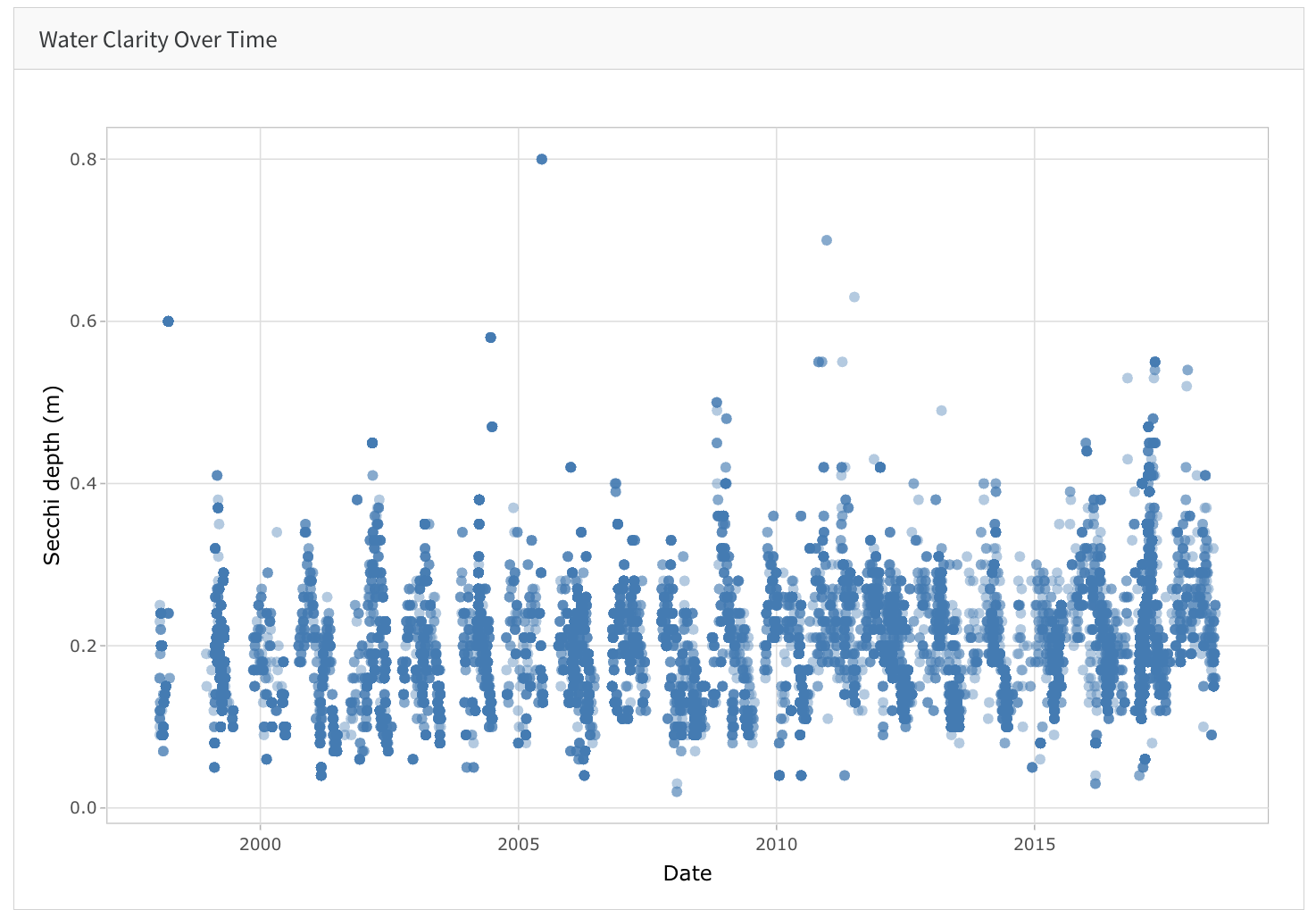
The card title comes from #| title: – it appears as the card header in the dashboard. The two rows now sum to 100% of the page height (25% + 75%).
NoteExercise: Show a static plot instead
Notice the difference if you remove the ggplotly() call, and just return p as a plain ggplot2 object instead.
Step 3: Add an interactive table
Add a second chunk inside the same ## Row {height="75%"} block to put a table alongside the chart:
```{r}
#| title: "Catch by Species"
fish %>%
  group_by(CommonName) %>%
  summarize(
    Observations = n(),
    `Total Catch` = sum(Count, na.rm = TRUE),
    `Avg Secchi (m)` = round(mean(Secchi, na.rm = TRUE), 2)
  ) %>%
  datatable(rownames = FALSE, options = list(pageLength = 5))
```
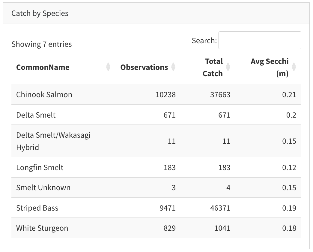
Multiple chunks in the same row produce side-by-side columns. Quarto divides the row width equally by default.
NoteExercise: Show a static table instead
Notice the difference if you remove the datatable() call, and instead format the data frame as a static HTML table using knitr::kable().
Step 4: Add a second page
Add a new # heading below everything to create a second page:
# Catch Trends

## Row

```{r}
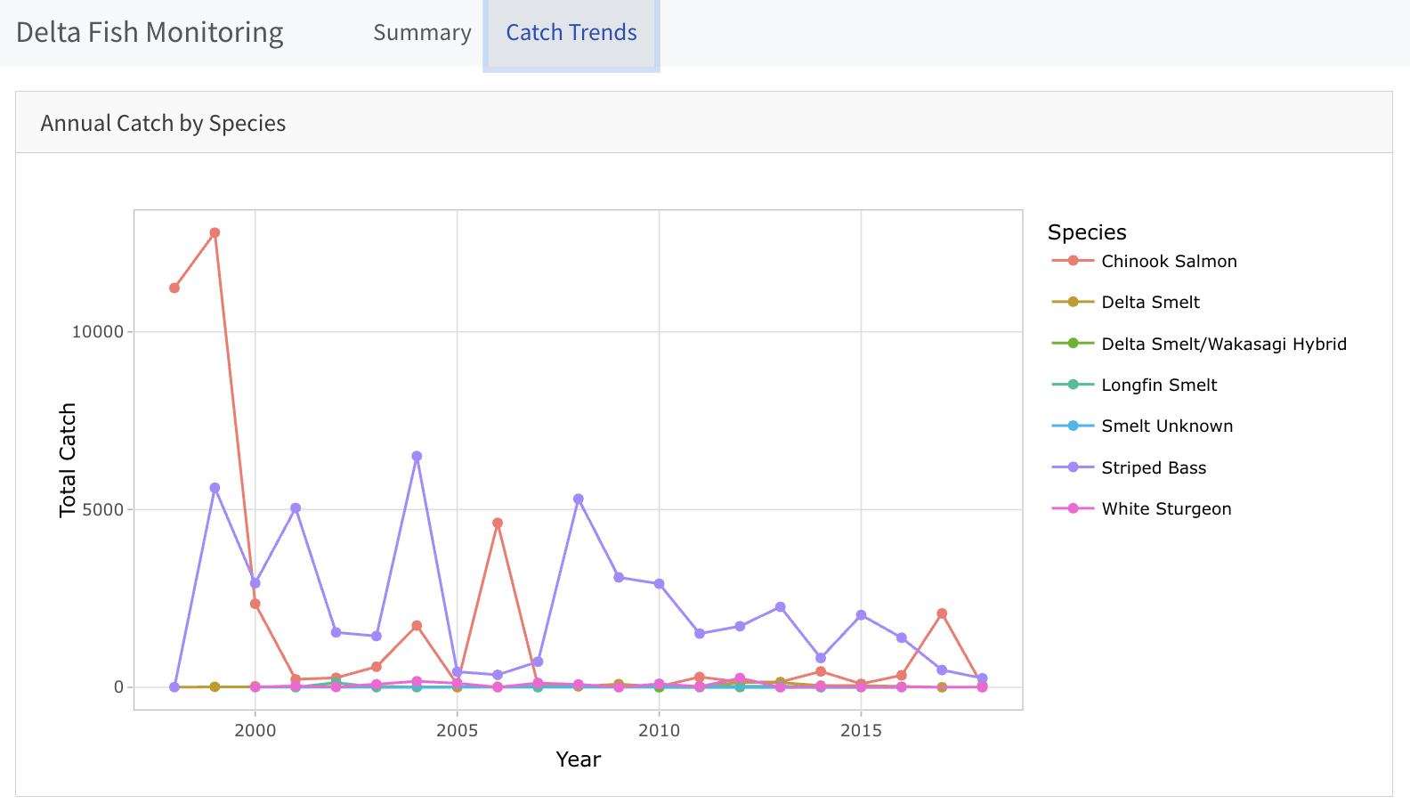
#| title: "Annual Catch by Species"
annual_catch <- fish %>%
  mutate(Year = year(SampleDate)) %>%
  group_by(Year, CommonName) %>%
  summarize(total_catch = sum(Count, na.rm = TRUE), .groups = "drop")

p2 <- annual_catch %>%
  ggplot(aes(x = Year, y = total_catch, color = CommonName)) +
    geom_line() +
    geom_point() +
    labs(x = "Year", y = "Total Catch", color = "Species") +
    theme_light()

ggplotly(p2)
```
The navigation bar now shows two pages: Summary and Catch Trends.
Step 5: Add tabsets
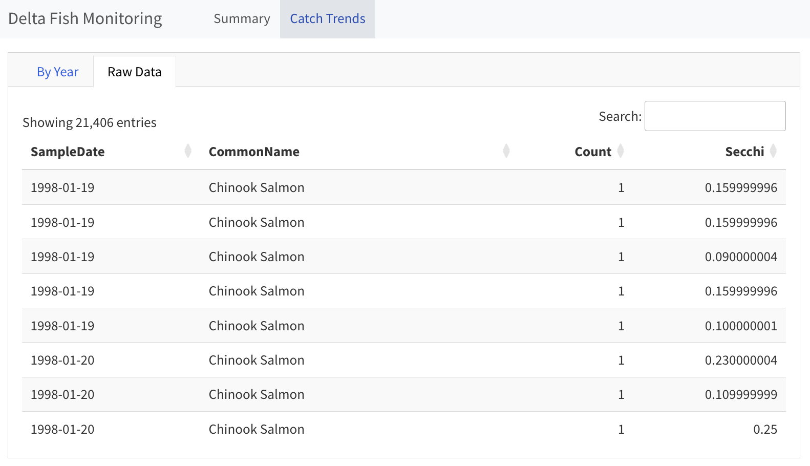
The Catch Trends page currently shows the annual chart as a single full-page card. Tabsets let you pack additional content into the same row: add .tabset to the ## Row heading and each code chunk becomes a separate tab.
Go back to the # Catch Trends page you added in Step 4 and replace its content with the following code; the only change to the existing row is adding .tabset, plus a second chunk for a raw data table:
# Catch Trends

## Row {.tabset}

```{r}
#| title: "By Year"
annual_catch <- fish %>%
  mutate(Year = year(SampleDate)) %>%
  group_by(Year, CommonName) %>%
  summarize(total_catch = sum(Count, na.rm = TRUE), .groups = "drop")

p2 <- annual_catch %>%
  ggplot(aes(x = Year, y = total_catch, color = CommonName)) +
    geom_line() +
    geom_point() +
    labs(x = "Year", y = "Total Catch", color = "Species") +
    theme_light()

ggplotly(p2)
```

```{r}
#| title: "Raw Data"
fish %>%
  select(SampleDate, CommonName, Count, Secchi) %>%
  datatable(rownames = FALSE)
```
Render again. The Catch Trends page should now show two tabs: the interactive line chart and a browseable raw data table.
Putting it all together
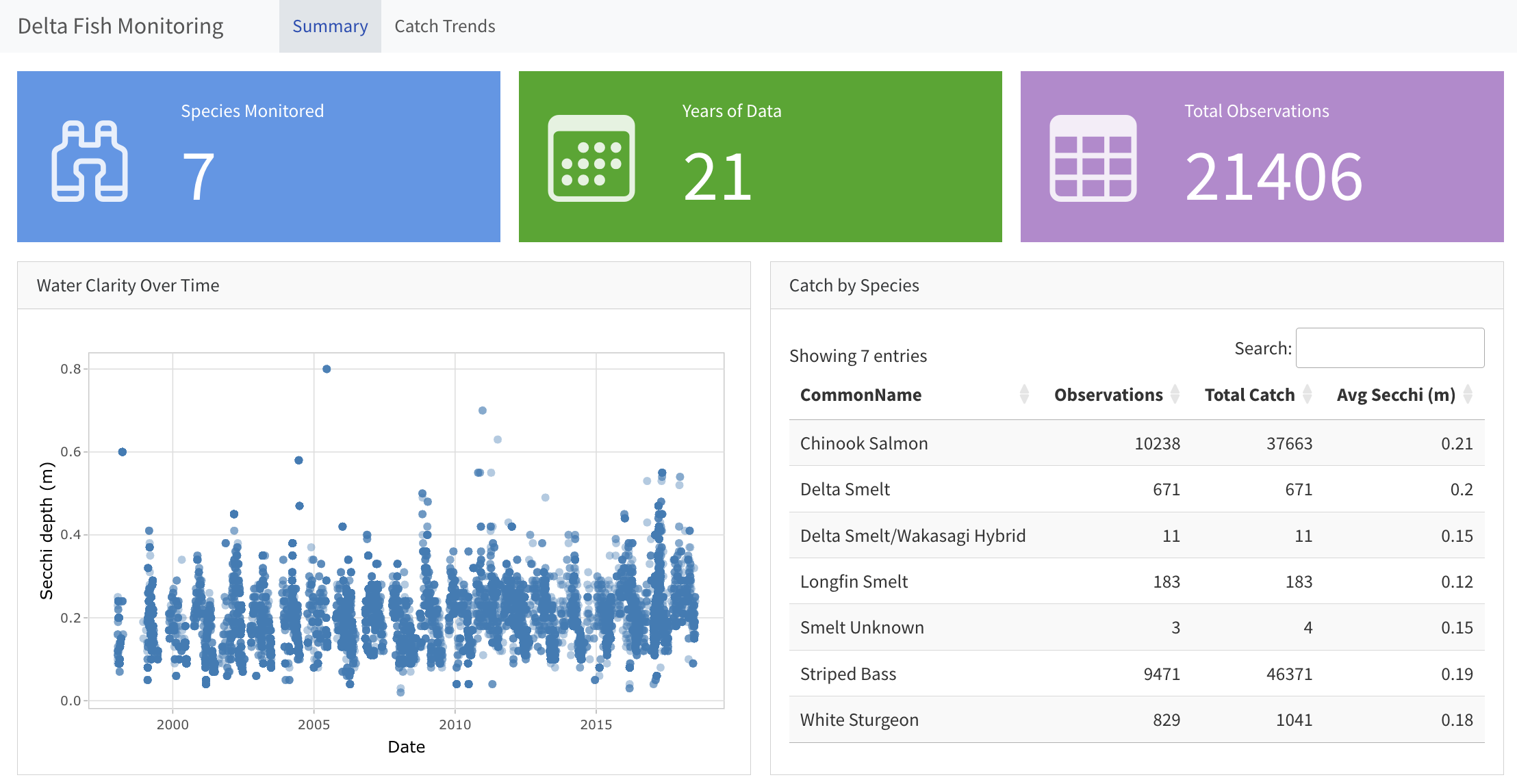
If you’ve been following along this whole time, you should now have a dashboard that looks something like this:
TipComplete delta-dashboard.qmd
---
title: "Delta Fish Monitoring"
format:
  dashboard:
    theme: cosmo
---

```{r}
#| label: load packages

library(readr)
library(dplyr)
library(lubridate)
library(plotly)
library(DT)
```

```{r}
#| label: load data

# Set paths
yolo_catch_url <- "https://pasta.lternet.edu/package/data/eml/edi/233/2/015e494911cf35c90089ced5a3127334"
data_dir <- "data"
yolo_catch_file <- file.path(data_dir, "yolo_catch.csv")

# Download data if not already cached
if (!file.exists(yolo_catch_file)) {
  message("Downloading file...")
  dir.create(data_dir, showWarnings = FALSE, recursive = TRUE)
  download.file(
    url = yolo_catch_url,
    destfile = yolo_catch_file
  )
  message("Saved to: ", yolo_catch_file)
} else {
  message("Using cached file.")
}

# Load the (locally cached) data
fish <- read_csv(yolo_catch_file, guess_max = 100000) %>%
  mutate(SampleDate = mdy(SampleDate)) %>%
  filter(grepl("Salmon|Striped Bass|Smelt|Sturgeon", CommonName))
```

# Summary

## Row {height="25%"}

```{r}
#| content: valuebox
#| title: "Species Monitored"
list(icon = "binoculars", color = "primary",
     value = n_distinct(fish$CommonName))
```

```{r}
#| content: valuebox
#| title: "Years of Data"
list(icon = "calendar3", color = "success",
     value = n_distinct(year(fish$SampleDate)))
```

```{r}
#| content: valuebox
#| title: "Total Observations"
list(icon = "table", color = "info",
     value = nrow(fish))
```

## Row {height="75%"}

```{r}
#| title: "Water Clarity Over Time"
p <- fish %>%
  ggplot(aes(x = SampleDate, y = Secchi)) +
    geom_point(color = "#2C7BB6", alpha = 0.4) +
    labs(x = "Date", y = "Secchi depth (m)") +
    theme_light()

ggplotly(p)
```

```{r}
#| title: "Catch by Species"
fish %>%
  group_by(CommonName) %>%
  summarize(
    Observations = n(),
    `Total Catch` = sum(Count, na.rm = TRUE),
    `Avg Secchi (m)` = round(mean(Secchi, na.rm = TRUE), 2)
  ) %>%
  datatable(rownames = FALSE, options = list(pageLength = 5))
```

# Catch Trends

## Row {.tabset}

```{r}
#| title: "By Year"
annual_catch <- fish %>%
  mutate(Year = year(SampleDate)) %>%
  group_by(Year, CommonName) %>%
  summarize(total_catch = sum(Count, na.rm = TRUE), .groups = "drop")

p2 <- annual_catch %>%
  ggplot(aes(x = Year, y = total_catch, color = CommonName)) +
    geom_line() +
    geom_point() +
    labs(x = "Year", y = "Total Catch", color = "Species") +
    theme_light()

ggplotly(p2)
```

```{r}
#| title: "Raw Data"
fish %>%
  select(SampleDate, CommonName, Count, Secchi) %>%
  datatable(rownames = FALSE)
```
6 Applying a Theme
Change the theme: in your YAML to any of the available Bootstrap themes:
format:
  dashboard:
    theme: flatly
Available themes: cerulean, cosmo, cyborg, darkly, flatly, journal, lumen, lux, minty, pulse, sandstone, simplex, sketchy, slate, solar, spacelab, superhero, united, vapor, yeti, zephyr.
Re-render to see the change immediately. Themes like flatly, lumen, and cosmo tend to look professional and clean. For a dramatic alternative, try darkly.
Browse the full gallery and explore further customization options at quarto.org/docs/dashboards/theming.html.
7 Your Turn
NoteExercise: Extend the Delta Dashboard
Working on your delta-dashboard.qmd, complete the following tasks:
Add a value box that shows the date range of the data (e.g., “1998 - 2018”).
- Hint: extract the year with
format(min(fish$SampleDate), "%Y") - Combine two year strings with
paste0(start_year, " - ", end_year)
- Hint: extract the year with
Add a smoothed trend line to the Secchi depth scatter plot.
- Add
geom_smooth(method = "loess", color = "firebrick")to the ggplot before callingggplotly()
- Add
Add a third page with a visualization or summary of your choosing. Some ideas:
- A bar chart of total catch by species across all years
- A histogram of Secchi depth values
- A summary table of the 10 most recent observations
Try two different themes and pick the one you prefer. Change
theme:in your YAML and re-render each time.Revise the layout by converting the main chart row of the Summary page to a tabset showing the Secchi chart and the catch table as tabs instead of side by side.
TipTips
- Bootstrap Icons gallery: icons.getbootstrap.com – search by keyword (try “water”, “arrow-up”, “bar-chart”)
- Value box color options:
primary,secondary,success,info,warning,danger - Quarto Dashboard theming reference: quarto.org/docs/dashboards/theming.html
8 Bonus: Adding Shiny Interactivity
Static dashboards cover a lot of ground, especially with interactive components like plotly figures and DT tables. However, if you need reactive user input such as filtering by date, selecting a species, or re-running a model, you can layer Shiny into a Quarto Dashboard.
Add server: shiny to the YAML:
---
title: "My Reactive Dashboard"
format: dashboard
server: shiny
---
Then label your data-loading chunk with context: setup (runs once on startup), use ## Sidebar {.sidebar} to create an input panel, place an output placeholder in the body, and fill it in a context: server chunk:
```{r}
#| context: setup
fish <- read.csv(...)
```

## Sidebar {.sidebar}

```{r}
sliderInput("date_range", "Date range:", ...)
```

## Row

```{r}
plotOutput("my_plot")  # UI: reserves the card slot and registers an ID
```

```{r}
#| context: server
output$my_plot <- renderPlot({ ... })  # server: reactively fills the slot
```
Note
Shiny dashboards require hosting where an R session can run – Posit Connect Cloud (connect.posit.cloud), shinyapps.io, a Shiny server, or your own computer just for internal purposes – just like standalone Shiny apps. Consequently, they don’t have the same ease of deployment as plain Quarto dashboards.
Applying this to the Delta Dashboard
Here is exactly what to change in delta-dashboard.qmd to add and use a species multiselect. Step 4 below makes only one of the charts reactive to the multiselect input, but you can follow a similar pattern to make other charts and tables reactive too.
1. YAML: Add server: shiny.
---
title: "Delta Fish Monitoring"
format:
  dashboard:
    theme: cosmo
server: shiny
---
2. Setup chunk: Add context: setup to both the package and data loading chunks so that these happen only once at startup rather than once per user interaction. Here is an excerpted example for the package loading chunk:
```{r}
#| label: load packages
#| context: setup

library(readr)
...
```
3. Global sidebar: Add ## Sidebar {.sidebar} before the first # page heading so the input appears on every page. Within this chunk, we’ll add a Shiny multiselect widget.
## Sidebar {.sidebar}

```{r}
checkboxGroupInput(
  inputId = "species",
  label = "Select species:",
  choices  = sort(unique(fish$CommonName)),
  selected = sort(unique(fish$CommonName))
)
```
4. Reactive charts: Each reactive output requires a pair of chunks – one for the UI and one for the server. This means splitting up the single chunk we used in the ordinary dashboard document and adding the Shiny functions.
The UI chunk uses an *Output function to reserve space in the card, add the UI label, and name the output slot:
```{r}
#| title: "Annual Catch by Species"
plotlyOutput("annual_catch_plot")
```
The server chunk uses a render* function to fill the output slot reactively whenever input$species (from our widget in the sidebar) changes. Don’t forget to add filter(CommonName %in% input$species) to the data pipeline in this chunk!
```{r}
#| context: server
output$annual_catch_plot <- renderPlotly({
  annual_catch <- fish %>%
    filter(CommonName %in% input$species) %>%
    mutate(Year = year(SampleDate)) %>%
    group_by(Year, CommonName) %>%
    summarize(total_catch = sum(Count, na.rm = TRUE), .groups = "drop")

  p2 <- annual_catch %>%
    ggplot(aes(x = Year, y = total_catch, color = CommonName)) +
      geom_line() +
      geom_point() +
      labs(x = "Year", y = "Total Catch", color = "Species") +
      theme_light()

  ggplotly(p2)
})
```
NoteWhy two chunks?
In a Quarto Dashboard with server: shiny, all reactive outputs require the explicit UI/server split: a UI chunk with the output placeholder created by calling *Output() with some id, and a context: server chunk that assigns to output$id using a corresponding render*() function.
| Output type | UI placeholder | Server renderer |
|---|---|---|
| ggplot2 | plotOutput("id") |
renderPlot({}) |
| Plotly | plotlyOutput("id") |
renderPlotly({}) |
| DT table | DTOutput("id") |
renderDT({}) |
| Value box | valueBoxOutput("id") |
renderValueBox({}) |
| Arbitrary HTML | uiOutput("id") |
renderUI({}) |
Calling renderPlot() or renderPlotly() inline without a matching output placeholder produces a blank card.
That is the whole pattern! Chunks that don’t use the fish data (or that you simply don’t need to be reactive) can stay unchanged.
9 Deploying Your Dashboard
Once your dashboard renders correctly, there are several ways to share it. Static dashboards (no Shiny) are easiest to host because they are just HTML files.
If you already have a GitHub repository, publish the rendered HTML to GitHub Pages using the same approach covered in the Quarto Websites session.
- Render locally:
quarto render delta-dashboard.qmd - Commit the generated
delta-dashboard.htmlto your repository - Enable GitHub Pages in the repository settings
Posit Connect Cloud is a free hosting service from Posit for Quarto content and Shiny apps. Create an account, then publish directly from the terminal:
quarto publish connect-cloud delta-dashboard.qmdFollow the prompts to authenticate in your browser. Your dashboard will be assigned a public URL under connect.posit.cloud. Posit Connect Cloud handles both static dashboards and Shiny dashboards (with server: shiny).
shinyapps.io is an older Posit service that also hosts Shiny dashboards. If your dashboard uses server: shiny and you already have a shinyapps.io account, publish using the Publish button or the rsconnect package:
Click the Publish icon (cloud with arrow) in the Viewer toolbar after running the app, or run rsconnect::deployApp("path/to/your/dashboard") in the Console.
Click the blue Publish button in the top-right corner of the running app window.
See the Shiny session for full account setup instructions.
10 Resources
- Quarto Dashboards documentation is the official reference for all layout options, components, and theming
- Quarto Dashboard layout guide shows detailed layout options with examples
- Quarto theming reference describes dashboard color and font options
- Bootstrap Icons gallery is a searchable icon library for value boxes
- plotly for R is an interactive chart library that integrates with
ggplot2 - DT package documentation shows how to create interactive HTML tables using R