### Data wrangling
library(readr)
library(here) ### for robust relative file paths
library(dplyr)
library(tidyr)
library(forcats) ### tools for working with factors (e.g., reordering)
library(janitor) ### clean column names
### Visualization
library(ggplot2)
### Interactive output
library(plotly)1 Overview
ggplot2 is a popular package for visualizing data in R, designed to work seamlessly with the tidyverse ecosystem of packages. From the home page:
ggplot2is a system for declaratively creating graphics, based on The Grammar of Graphics. You provide the data, tellggplot2how to map variables to aesthetics, what graphical primitives to use, and it takes care of the details.
The goal of this lesson is to explain the fundamentals of how ggplot2 work, introduce useful functions for customizing your plots, and inspire you to go and explore this awesome resource for visualizing your data.
Note
ggplot2 vs base graphics in R vs others
There are many different ways to plot your data in R. All of them can be used to make functional plots! However, ggplot2 uses a reasonably intuitive syntax to build up a plot in layers and customize it in many different ways. It also has a lot of built in themes and color palettes that can make your plots look nice with just a few lines of code.
Base R graphics (plot(), hist(), etc) can be helpful for simple, quick-and-dirty plots, e.g., for data exploration, but it can be hard to decipher and customize. ggplot2 can be used for almost everything else, including publication-ready graphics.
2 Setup
Make sure you’re in the right project (training_<username>). Use Git Pull to check for any changes. Then, create a notebooks/ folder at the top level of your project, create a new Quarto document, and save it as data-visualization.qmd inside that folder.
- Depending on your IDE, the new document may include default template content below the YAML header. If so, delete anything below the
---before continuing.
TipQuarto header options?
Consider adding Quarto options to the YAML header to control the output:
format:
  html:
    code-fold: true
    code-summary: "Show code"
    embed-resources: true
execute:
  warning: false
  message: false
2.1 Load Packages
Load the packages we’ll need. They’re grouped by purpose to make it easier to remember what each one does.
2.2 Load the Data
Download the data from the EDI Data Repository: scroll to Resources, click the “Socioecological monitoring data” download button, and save to your data/ folder. Then read it in:
# read in data from the data directory after manually downloading data
delta_visits_raw <- read_csv(here("data/Socioecological_monitoring_data.csv"))
2.3 Learn About the Data
For this session we are going to be working with data on Socioecological Monitoring on the Sacramento-San Joaquin Delta. Check out the documentation: read the abstract, explore the metadata, check the intellectual rights, etc.
2.4 Explore the Data
Finally, let’s explore the data we just read into our working environment.
### Check out column names
colnames(delta_visits_raw)

### Peek at each column and class
glimpse(delta_visits_raw)

### From when to when
range(delta_visits_raw$Date)

### Which time of day?
unique(delta_visits_raw$Time_of_Day)
3 Prepare the Data
We nearly always need to do some wrangling before we can analyze and plot our data. Here we will wrangle our data into a tidy format that is ggplot2-friendly.
3.1 Clean Column Names
janitor::clean_names() converts all column names to consistent snake_case in a single line:
colnames(delta_visits_raw)[1:6][1] "EcoRestore_approximate_location" "Reach"
[3] "Latitude" "Longitude"
[5] "Date" "Time_of_Day" delta_visits <- delta_visits_raw %>%
janitor::clean_names()
colnames(delta_visits)[1:6][1] "eco_restore_approximate_location" "reach"
[3] "latitude" "longitude"
[5] "date" "time_of_day" 3.2 Reshape to Long (Tidy) Format
Recall the tidy data principles.
- Each variable is a column; each column is a variable.
- Each observation is a row; each row is an observation.
- Each value is a cell; each cell is a single value.
Which (if any) of these principles are violated in our data frame delta_visits?
ggplot2 works best with tidy data — one row per observation. Our visitor-type counts are spread across multiple columns, so we pivot them (using tidyr::pivot_longer()) into a single visitor_type column:
visits_long <- delta_visits %>%
  tidyr::pivot_longer(
    cols = c(sm_boat, med_boat, lrg_boat, bank_angler, scientist, cars),
    names_to = "visitor_type",
    values_to = "quantity"
  ) %>%
  ### shorten the long name:
  dplyr::rename(restore_loc = eco_restore_approximate_location) %>%
  ### drop the notes column:
  dplyr::select(-notes)

glimpse(visits_long)
Rows: 330
Columns: 8
$ restore_loc <chr> "Decker Island", "Decker Island", "Decker Island", "Decke…
$ reach <chr> "Brannan to Decker Island", "Brannan to Decker Island", "…
$ latitude <dbl> 38.10587, 38.10587, 38.10587, 38.10587, 38.10587, 38.1058…
$ longitude <dbl> -121.7064, -121.7064, -121.7064, -121.7064, -121.7064, -1…
$ date <date> 2017-07-07, 2017-07-07, 2017-07-07, 2017-07-07, 2017-07-…
$ time_of_day <chr> "unknown", "unknown", "unknown", "unknown", "unknown", "u…
$ visitor_type <chr> "sm_boat", "med_boat", "lrg_boat", "bank_angler", "scient…
$ quantity <dbl> 0, 2, 0, 1, 0, 0, 0, 4, 0, 3, 0, 0, 0, 0, 0, 0, 0, 0, 0, …4 Plot With ggplot2
4.1 Essential Components
Every ggplot2 call requires four essential components:
ggplot()opens the plot (note, the package is calledggplot2but the function is justggplot(). What happened to the originalggplot? it is still out there, but really only for historical interest!)data = <dataframe>defines the dataframe to usemapping = aes(<args>)maps variables to aesthetic visual properties (x axis, y axis, size, color, fill, etc.)geom_*()defines the plot type, aka geometry (bar, column, point, line, box, etc.)
Layers are added with + operator instead of a pipe operator %>% or |>.
ggplot(data = daily_visits_loc,
       mapping = aes(x = restore_loc, y = daily_visits)) +
  geom_col() +
  labs(title = 'Plot title')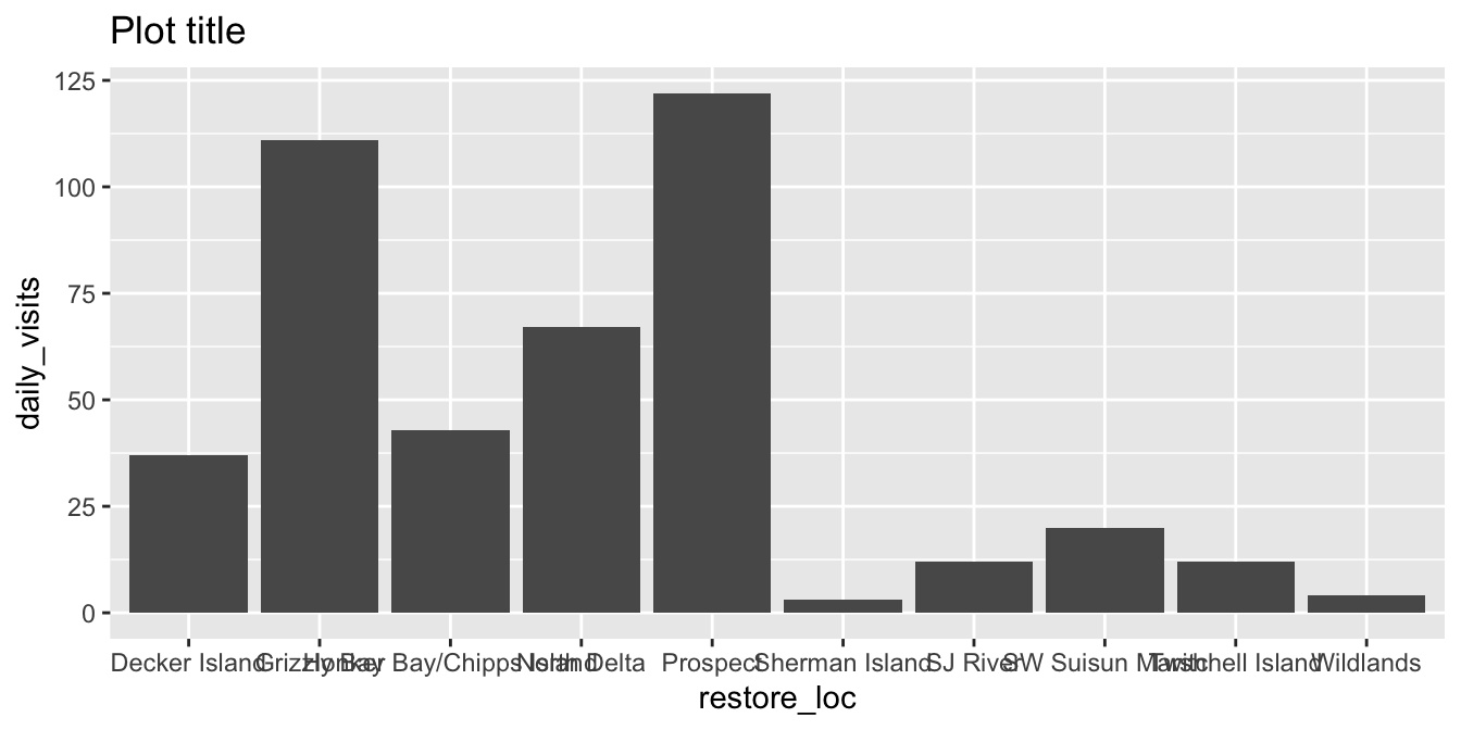
Tip
data = <df> and mapping = aes() can also live inside the geom_*() call — useful when layering multiple data sources! But for simple plots, a good practice is to keep them in ggplot() for clarity. The data = argument name is typically left out unless plot data are coming from multiple dataframes; the mapping = argument name is typically left out as well.
Variations on data= and aes(): Options 1 - 3 produce the same output as above. Option 4 flips the axes. Examine the code and the outputs.
Data and mapping defined in ggplot() function:
ggplot(data = daily_visits_loc,
       aes(x = restore_loc, y = daily_visits)) +
    geom_col()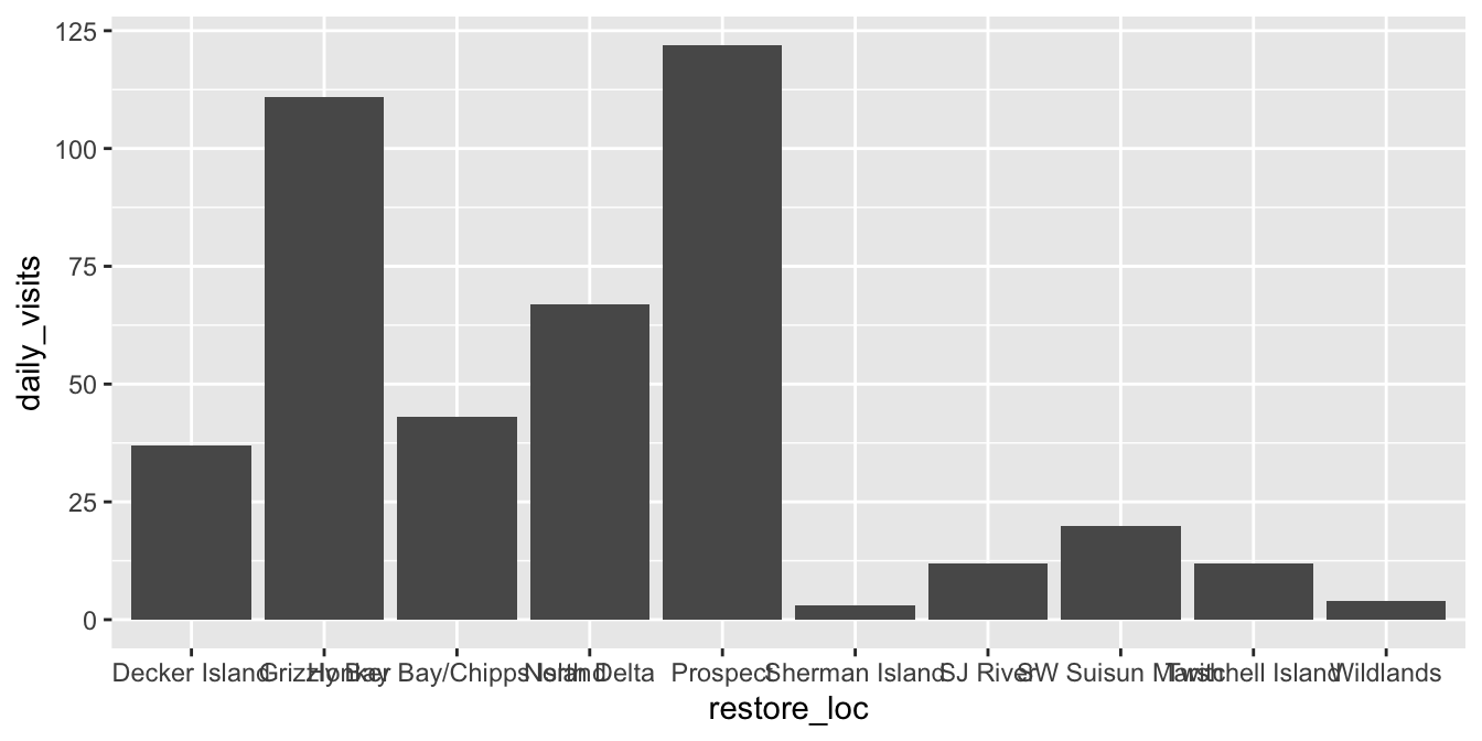
Data defined in ggplot() function; mapping defined in geom_*():
ggplot(data = daily_visits_loc) +
    geom_col(aes(x = restore_loc,
                 y = daily_visits))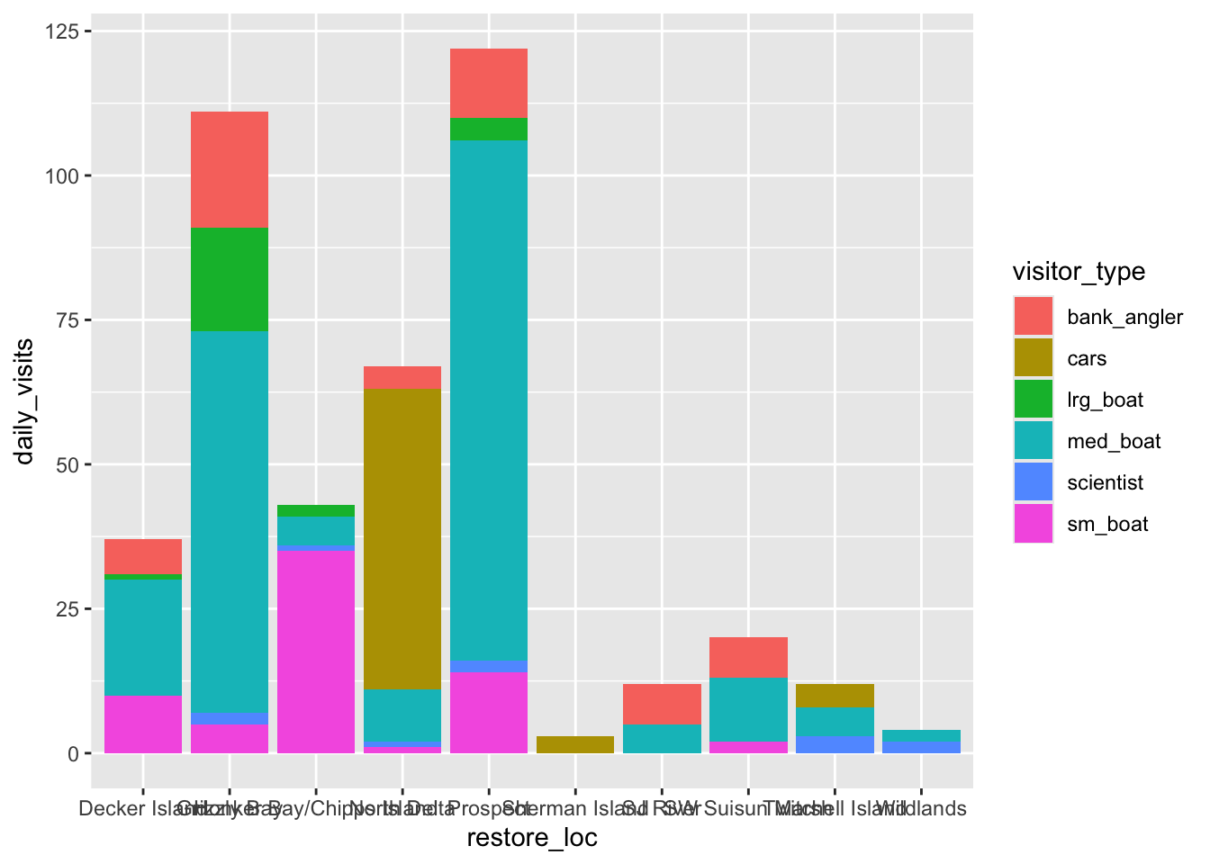
Data and mapping both defined in geom_*()
ggplot() +
    geom_col(data = daily_visits_loc,
             aes(x = restore_loc, y = daily_visits))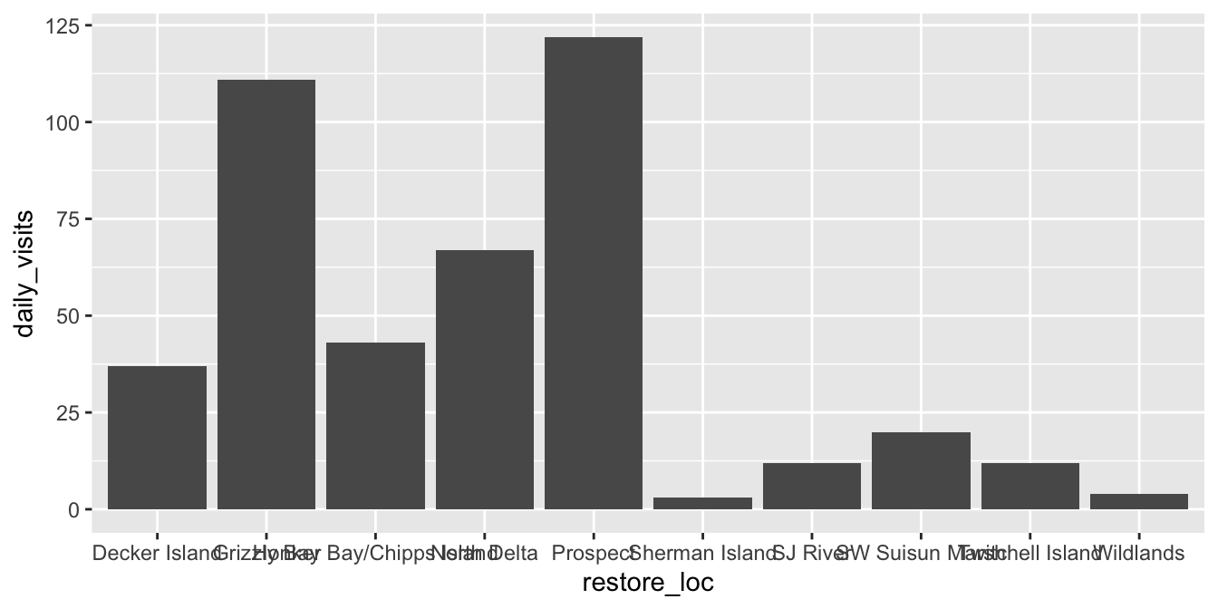
Data and mapping both defined in geom_*(), but with x and y flipped. Why might you prefer this?
ggplot() +
    geom_col(data = daily_visits_loc,
             aes(y = restore_loc, x = daily_visits))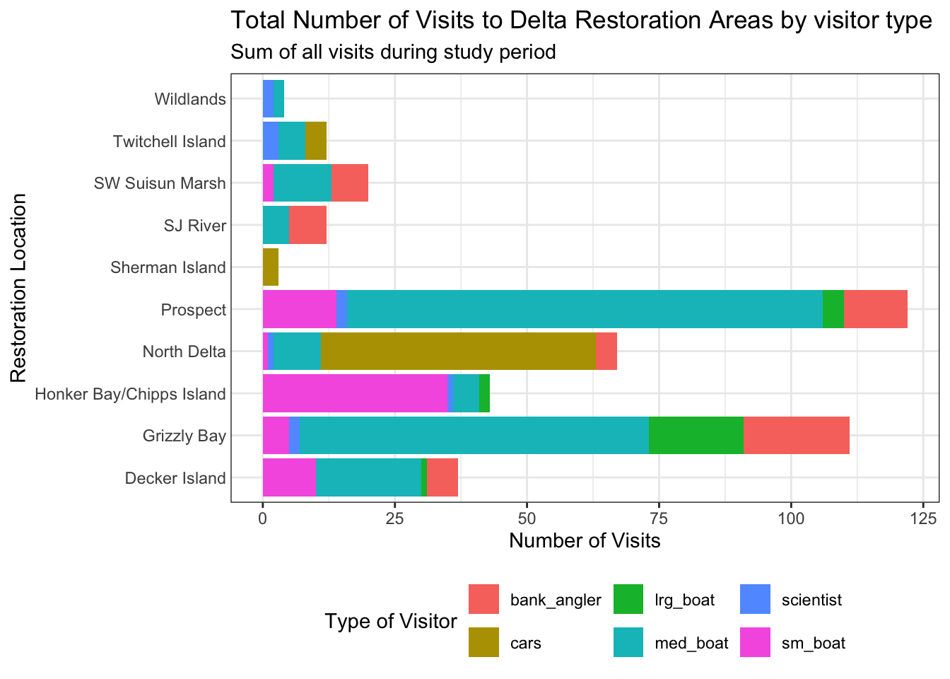
4.2 Different Geometries for Different Plot Types
Having the basic structure with the essential components in mind, we can easily change the type of graph by updating the geom_*(). First let’s filter the data to remove some extreme values, and to focus on boat users specifically.
daily_boats_filtered <- daily_visits_loc %>%
    filter(daily_visits < 30,
           visitor_type %in% c("sm_boat", "med_boat", "lrg_boat"))
TipPiping directly into
ggplot()
Because ggplot() takes data as its first argument, you can pipe a data frame straight into it without creating an intermediate object:
daily_visits_loc %>%
    filter(daily_visits < 30,
           visitor_type %in% c("sm_boat", "med_boat", "lrg_boat")) %>%
    ggplot(aes(x = visitor_type, y = daily_visits)) +
    geom_boxplot()
This is handy for quick exploration, but use it carefully: chaining too many wrangling steps with a ggplot() call can make code harder to read and debug. A good rule of thumb: if the filter/transform is specific to this plot, pipe it in; if it would be useful elsewhere, save it to a named object first.
ggplot(data = daily_boats_filtered,
       aes(x = visitor_type, y = daily_visits)) +
    geom_boxplot()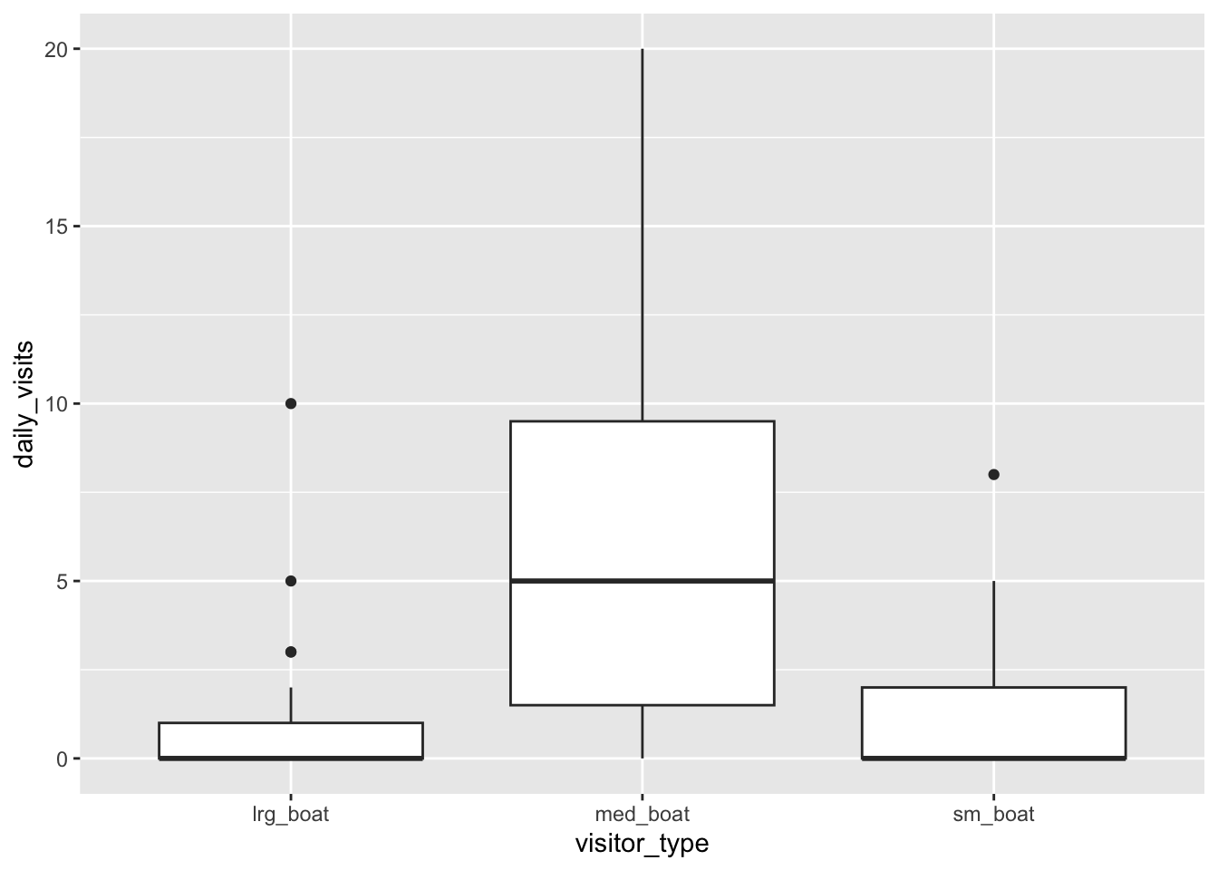
Note, axes flipped to make it easier to read the labels.
ggplot(data = daily_boats_filtered,
       aes(x = daily_visits, y = visitor_type)) +
    geom_violin()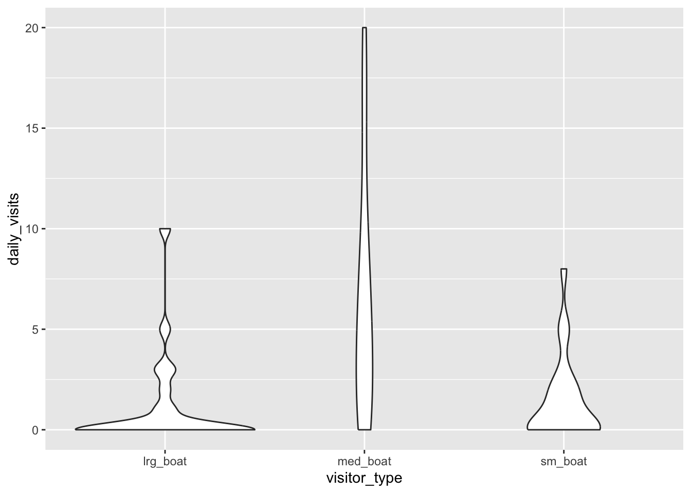
Axes flipped, and all observations now plotted using geom_jitter(), which adds a small amount of random variation to the location of each point, to prevent overplotting. Note the geom_*() functions have additional parameters to control appearance.
ggplot(data = daily_boats_filtered,
       aes(x = daily_visits, y = visitor_type)) +
    geom_boxplot() +
    geom_jitter(height = .1)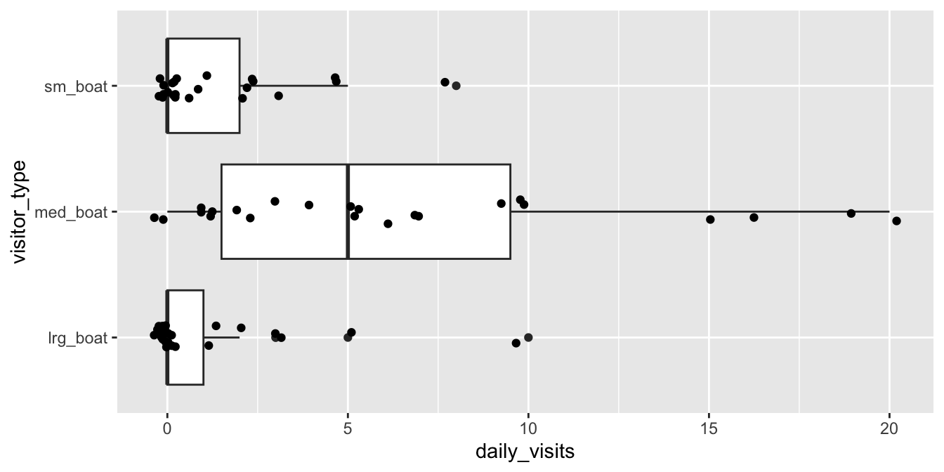
Note, new aesthetics: color is now mapped to visitor_type. Note the legend!
ggplot(data = daily_boats_filtered,
       aes(x = date, y = daily_visits)) +
    geom_point(aes(color = visitor_type))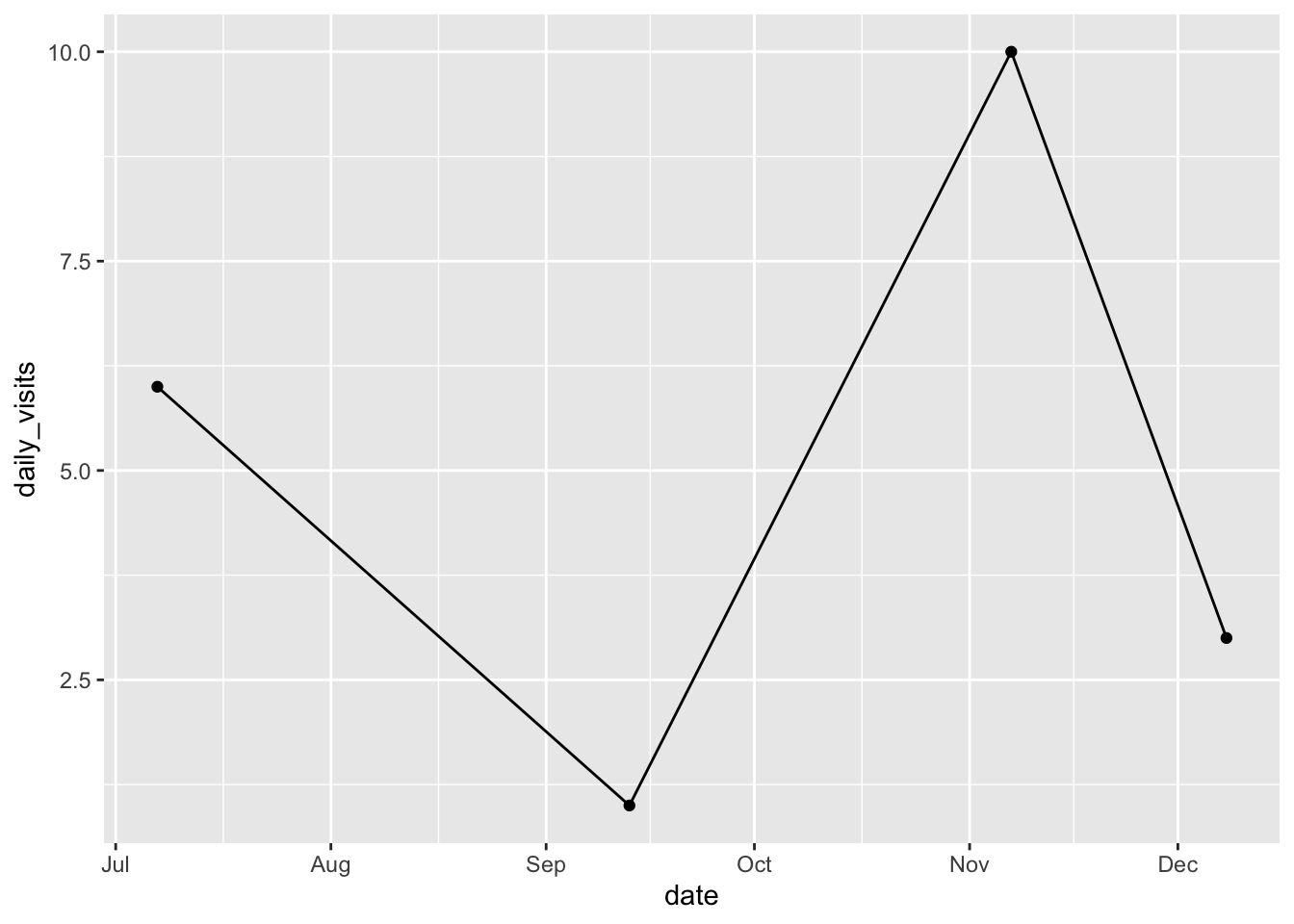
4.3 The Grammar of Graphics
The components above are entry points to a richer underlying framework called the Grammar of Graphics. A quick look at this framework will help you reason about what’s possible, and what to change when plots don’t look right.
| Component | Role |
|---|---|
Aesthetic (aes()) |
Maps a data column to a visual property (x, y, color, shape, fill, …) |
| Scale | Translates raw data values into visual values (e.g., dates → pixel positions; species names → colors) |
| Guide | Communicates the scale back to the viewer (axes and legends) |
| Geom | The visual mark drawn for each observation (geom_point(), geom_col(), …) |
| Stat | Statistical transformation applied before drawing; geom_point() leaves data unchanged (stat_identity), while geom_boxplot() computes IQR and median automatically |
You rarely call scale, guide, or stat functions directly; ggplot2 picks sensible defaults. But knowing they exist explains why geom_boxplot() “just works” without you computing a median first, and gives you the vocabulary to find the right function when you want to override a default.
5 Customize the Plot
We’ll build our final bar chart in two focused steps: labels & theme, then colors & ordering.
5.1 Set Labels, Axes, and Themes
TipInside vs. outside
aes()
- Inside
aes(): maps a variable to an aesthetic: an aesthetic (e.g.,x,y,color,fill…) changes for each element as the variable changes.
- Outside
aes(): sets a constant: all elements get the same value for that aesthetic.
Set column fill and color to specific, valid colors outside aes(). All bars are the same fill and outline color!
ggplot(data = daily_visits_loc,
       aes(x = restore_loc, y = daily_visits)) +
  geom_col(color = 'red',
           fill = "steelblue")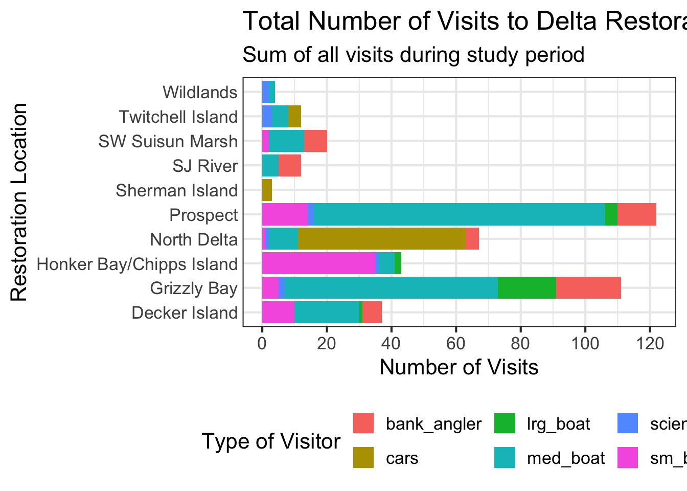
Set column fill to map to a single variable, inside aes() (whether the result makes sense, that’s on you). Note, the color = red here is set outside the aes() so remains constant.
ggplot(data = daily_visits_loc,
       aes(x = restore_loc, y = daily_visits)) +
  geom_col(aes(fill = visitor_type),
           color = 'red')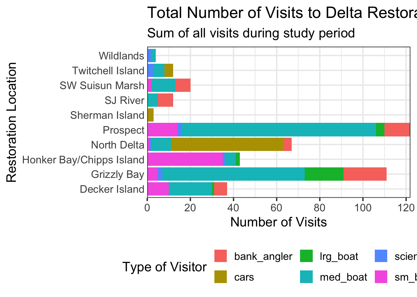
Setting to a specific color inside the aes() function is incorrect. This doesn’t throw an error, but clearly does not reflect what you might be hoping for! Note, the color = red here is set outside the aes() so remains constant (and correct!).
ggplot(data = daily_visits_loc,
       aes(x = restore_loc, y = daily_visits, fill = "blue")) +
  geom_col(color = 'red')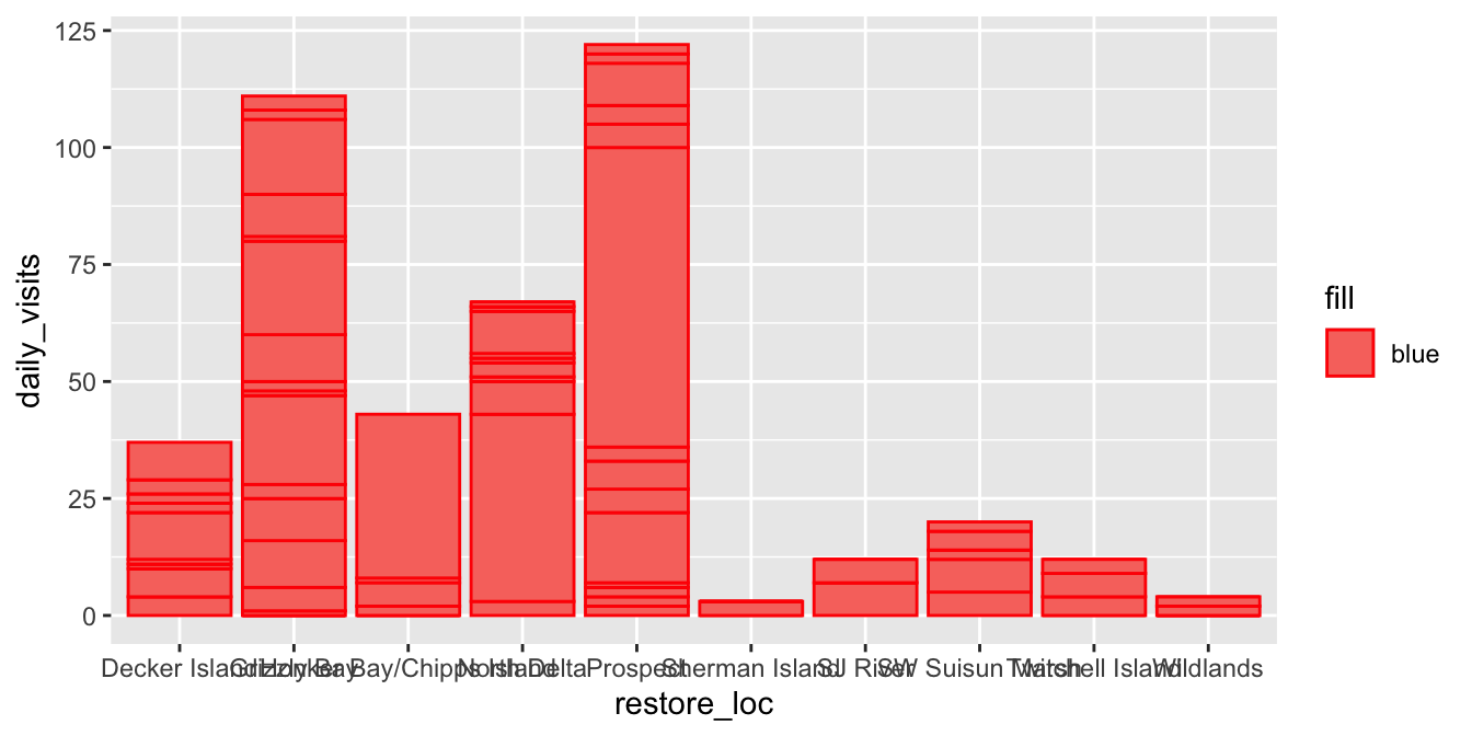
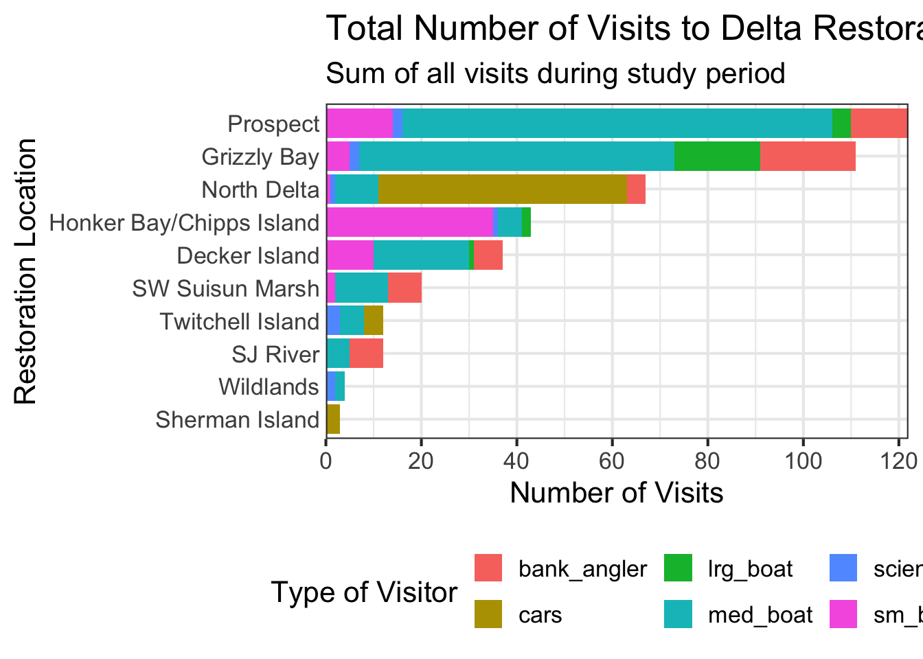
To our basic bar chart, let’s clean it up using some of the above ideas, and some new ones:
- Map
fillto track thevisitor_type - flip the axes so location labels are readable
- add informative labels
- apply a clean theme
ggplot(data = daily_visits_loc,
aes(y = restore_loc, x = daily_visits, fill = visitor_type)) +
geom_col() +
labs(x = "Number of Visits",
y = "Restoration Location",
fill = "Visitor Type",
title = "Total Visits to Delta Restoration Areas by Visitor Type",
subtitle = "Sum of all visits July 2017 - March 2018") +
scale_x_continuous(breaks = seq(0, 120, 20), expand = c(0, 0)) +
theme_minimal() +
theme(
legend.position = "bottom",
axis.ticks.y = element_blank()
)- 1
-
labs()to rename axes, legend, title, subtitle, etc. - 2
-
scale_x_continuous()to set x-axis breaks & labels, and remove padding (expand) - 3
-
theme_minimal(),theme_bw(), and other built-in themes for a clean, publication-ready plot - 4
-
theme()to customize specific theme elements (e.g., legend position) - 5
-
element_blank()to effectively turn off any theme element
TipBuilt-in and custom themes
Always call theme() after built-in themes like theme_minimal(), or the built-in theme will override your tweaks.
You can also create your own custom theme object to reuse across plots, just as you would a built-in theme - just wrap your theme choices in a function!
my_theme <- function(size = 14) {
    theme_minimal(base_size = size) +
    theme(legend.position = "bottom",
          axis.ticks.y = element_line(color = "red", size = 0.5))
}
5.2 Position Adjustments
Notice the bar chart above stacks bars for each visitor_type on top of one another. This is controlled by the position argument of geom_col(), which defaults to "stack". Three positions are useful for grouped categorical data:
Each group is stacked; total bar length shows the overall sum.
ggplot(data = daily_visits_loc,
       aes(y = restore_loc, x = daily_visits, fill = visitor_type)) +
  geom_col(position = "stack") +
  labs(x = "Number of Visits", y = "Restoration Location", fill = "Visitor Type") +
  theme_minimal() + theme(legend.position = "bottom")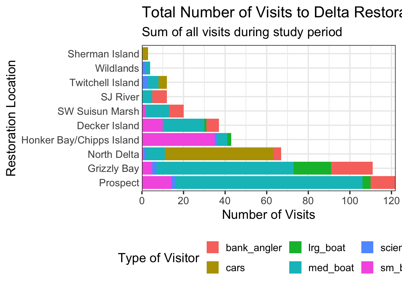
Each group is placed side-by-side; easier to compare within a location.
ggplot(data = daily_visits_loc,
       aes(y = restore_loc, x = daily_visits, fill = visitor_type)) +
  geom_col(position = "dodge") +
  labs(x = "Number of Visits", y = "Restoration Location", fill = "Visitor Type") +
  theme_minimal() + theme(legend.position = "bottom")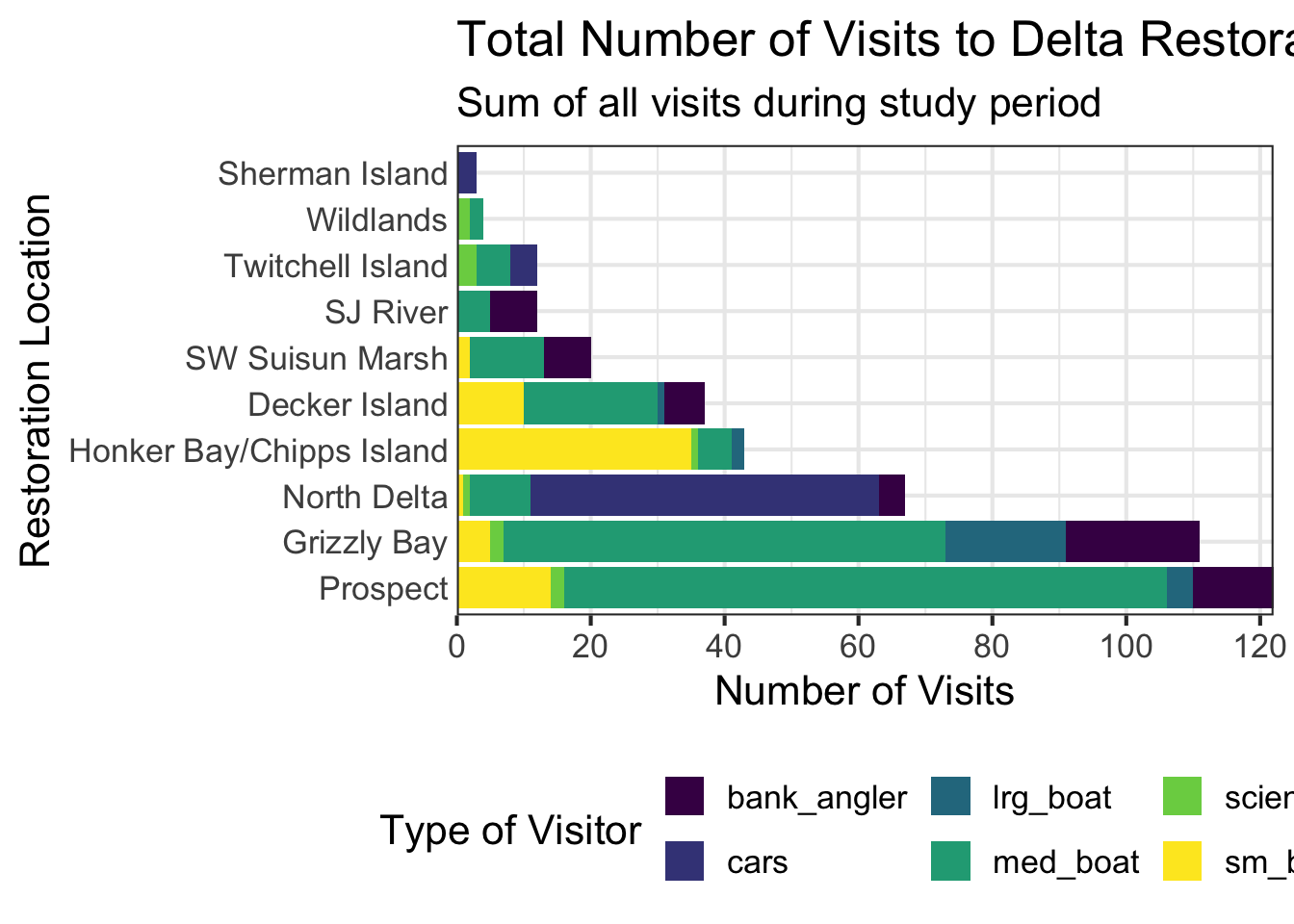
Each bar is scaled to 100%; shows proportions rather than totals.
ggplot(data = daily_visits_loc,
       aes(y = restore_loc, x = daily_visits, fill = visitor_type)) +
  geom_col(position = "fill") +
  labs(x = "Proportion of Visits", y = "Restoration Location", fill = "Visitor Type") +
  theme_minimal() + theme(legend.position = "bottom")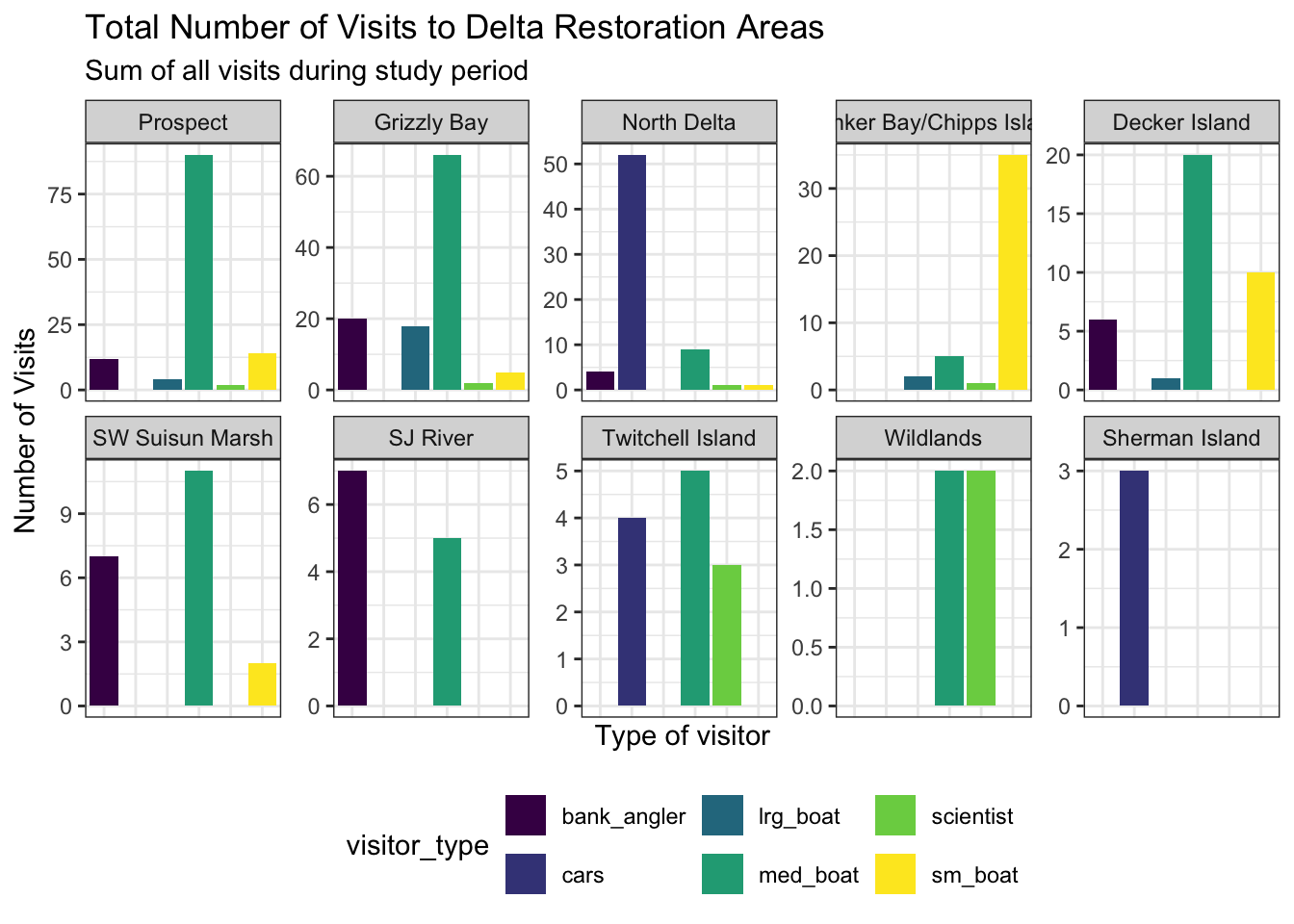
5.3 Order Categorical Values and Add Color
For categorical variables (e.g., text), ggplot2 defaults to displaying values in alphabetical order (see the plots above). We can use factors (ordered vectors of categorical values) to force a particular display order. One easy approach is to use forcats::fct_reorder() from forcats to sort by a meaningful variable instead (the levels of a factor determine the order of values).
daily_visits_totals <- daily_visits_loc %>%
  group_by(restore_loc) %>%
  mutate(total = sum(daily_visits)) %>%
  ungroup() %>%
  mutate(restore_loc = fct_reorder(restore_loc, desc(total)))

unique(daily_visits_totals$restore_loc)
[1] Decker Island Grizzly Bay Honker Bay/Chipps Island
[4] North Delta Prospect SJ River
[7] SW Suisun Marsh Sherman Island Twitchell Island
[10] Wildlands
10 Levels: Prospect Grizzly Bay North Delta ... Sherman IslandNote that fct_reorder() defaults to sorting in ascending order, so the location with the lowest total visits will be at the bottom of the plot. To reverse this, add desc() around the variable you are sorting by: fct_reorder(restore_loc, desc(total)). Note how Prospect is the first level of the factor, and has the highest total visits.
Default colors in ggplot2 are not the most appealing, and not ideal for accessibility. There are many options available, and colors in ggplot could be an entire topic in itself. Here are some quick tips:
Use scale_color_*() or scale_fill_*() to select or modify color palettes. Good choices:
scale_color_viridis_c/d(): Colorblind-friendly, perceptually uniform (continuous ordiscrete)scale_color_brewer(): ColorBrewer palettes (categorical, sequential, diverging)scale_color_gradient(): Custom two-color gradientscale_color_gradient2(): Diverging gradient with midpointscale_color_manual(): Fully custom discrete colors
You can use either color names (e.g., “steelblue”, “salmon”, “orchid”) or hex codes (e.g., “#4682B4”, “#FA8072”, “#DA70D6”) to specify colors in R. Hex codes are more precise and allow for a wider range of colors, but color names can be easier to remember and read in code.
Use colors() to see all available color names in R, or check out this cheat sheet.
Use the alpha argument to set transparency, which can help with overplotting. For example, geom_point(alpha = 0.5) will make points semi-transparent.
Let’s plot our daily visits data, with the locations ordered by total visits (from fct_reorder() above), and colored by visitor type. We’ll add a colorblind-friendly palette with scale_fill_viridis_d().
my_theme <- function(base_size = 14) {
    theme_minimal(base_size = base_size) +
    theme(legend.position = "bottom",
          panel.grid.major = element_line(color = 'slateblue1'))
}

ggplot(data = daily_visits_totals,
       aes(y = restore_loc, x = daily_visits, fill = visitor_type)) +
  geom_col() +
  scale_fill_viridis_d() +
  scale_x_continuous(breaks = seq(0, 120, 20), expand = c(0, 0)) +
  labs(
    x = "Number of Visits",
    y = "Restoration Location",
    fill = "Visitor Type",
    title = "Total Visits to Delta Restoration Areas by Visitor Type",
    subtitle = "Sum of all visits during the study period"
  ) +
  my_theme()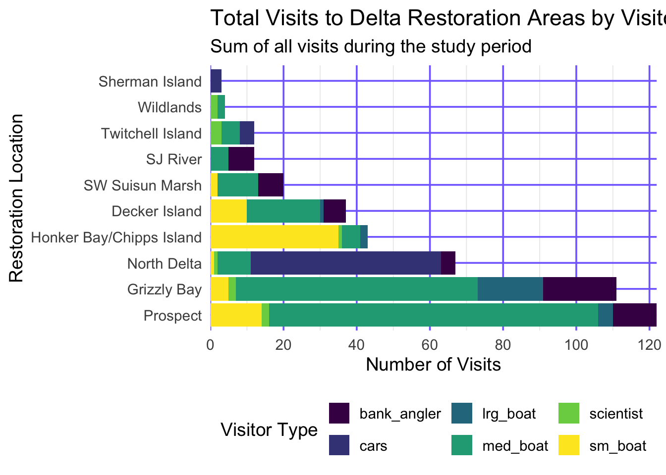
5.4 Save Your Plot
ggsave("figures/visit_restore_site_delta.jpg", width = 12, height = 6, units = "in")- By default,
ggsave()saves the last plot displayed, or you can passplot = my_objectto save a specific plot object.
- Set
width,height, andunitsto control the size of the output file.
- By default,
ggsave()guesses the output format from the file extension (e.g.,.jpg,.png,.pdf). See?ggsave()for more options.
6 Create “Small Multiple” Plots
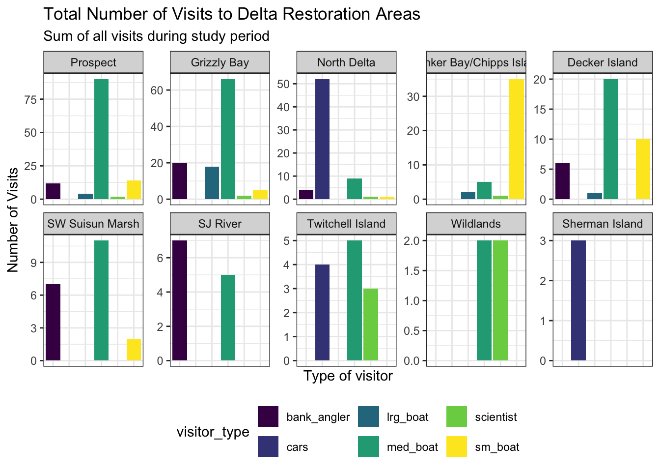
Plotting multiple lines or bars on a plot can convey a lot of information, but can also appear rather cluttered. Alternately, you can plot subsets or closely related variables using facet_wrap() in “small multiples”. Each unique value of a (usually categorical) variable is mapped to its own mini panel using the syntax facet_wrap(~ <variable_name>).
The default behavior puts all facets on the same x and y scale. Use the scales argument to allow different scales between facet plots (e.g. scales = "free_y" to let the y axis scale vary from facet to facet). Specify the number of columns using the ncol = argument or number of rows using nrow =.
See also facet_grid() for faceting by two variables.
facet_plot <- ggplot(data = daily_visits_totals,
aes(x = visitor_type, y = daily_visits,
fill = visitor_type)) +
geom_col() +
facet_wrap(~restore_loc,
scales = "free_y",
ncol = 5,
nrow = 2) +
scale_fill_viridis_d() +
labs(x = "Type of visitor",
y = "Number of Visits",
title = "Total Number of Visits to Delta Restoration Areas",
subtitle = "Sum of all visits during study period") +
theme_bw() +
theme(legend.position = "bottom",
axis.ticks.x = element_blank(),
axis.text.x = element_blank())
facet_plot- 1
- See tip below about spacing of multiple arguments!
Tip
In the example above, we added extra spaces so that the = equals signs line up when assigning values to multiple different arguments. R doesn’t care about spacing or indents, so this does not change any functionality. This is purely aesthetic, but lining up the equals signs may make the assigned values a little easier to scan quickly!
Save this plot to your figures folder.
ggsave(here("figures/visit_restore_site_facet.jpg"),
       plot = facet_plot,
       width = 12, height = 8, units = "in")
7 Interactive Plots with plotly
Most of the time, we will render our Quarto documents as .html files, which means we can include interactive elements in our documents. The plotly package provides a simple way to convert your static ggplot2 plots into interactive plots that a user can hover over, zoom in on, etc.
We already created a plot object above and stored it as the object facet_plot. To make this interactive, we can simply wrap it in ggplotly():
ggplotly(facet_plot, tooltip = c('x', 'y'))Note that any variable assigned to an aesthetic in the original ggplot (e.g., x, y, color, fill, etc.) will be included in the hover information in the interactive plot, by default. You can customize this further using the tooltip argument in ggplotly() - for example, here we only included the x and y variables (since x and fill are both visitor_type, we we don’t need to see it twice). See ?ggplotly for more options.
8 ggplot2 Resources
- R Graph Gallery by Yan Holtz - a gallery of beautiful plots for inspiration, with code examples.
- A
ggplot2tutorial for beautiful plotting in R by Cedric Scherer - a comprehensive tutorial onggplot2with lots of examples and tips for customizing your plots. - Modify components of a theme in
ggplot2documentation - an excellent resource for all the theme items you can customize. - Why not to use two axes, and what to use instead: The case against dual axis charts by Lisa Charlotte Rost - a thoughtful post about how to think about displaying multiple datasets simultaneously.