These exercises are adapted from Allison Horst’s EDS 221: Scientific Programming Essentials Course for the Bren School’s Master of Environmental Data Science program.
About the data
These exercises will be using data on abundance, size, and trap counts (fishing pressure) of California spiny lobster (Panulirus interruptus) and were collected along the mainland coast of the Santa Barbara Channel by Santa Barbara Coastal LTER researchers (Reed and Miller 2024).
Your task: Collaborate on an analysis and create a report to publish using GitHub Pages.
1 Setup Collaborative Repository
For this collaborative report, participants will be working in pairs. Each partner will focus on a different portion of the analysis, and the collaboration will bring the two sub-analyses together into a single collaborative report.
1.1 Create a New Repository With a Partner
- Select one partner to be the Owner; the other is the Collaborator
- The Owner creates a repository on GitHub titled
lobster_analysis(or similar). When creating the repository: (Collaborator help follow these directions!)- Add a brief description (e.g., “R Practice Session: Collaborating on, Wrangling & Visualizing Data”)
- Keep the repo Public
- Initialize the repo with a
READMEfile and an R.gitignoretemplate.
- The Owner invites the Collaborator to the repo on GitHub
- Settings Collaborators Manage Access Invite a collaborator
- Collaborator accepts invitation
- Both the Collaborator and the Owner clone the repo into their local computer (e.g., through RStudio, Positron, or Terminal)
Note, the repository was created as “public” so anyone can see and clone the repo, and make local changes, even without being added as a collaborator. However, non-collaborators will not have permissions to push changes back to the remote repository.
1.2 Create Files and Add Data
The Collaborator will set up new files for the analysis, while the Owner will download data and add it to the repository. Follow the instructions on the tab for your role.
For this exercise, we are creating folders for scripts, data, and figs, and allowing Git/GitHub to track our data, figures, and rendered HTML files along with our scripts. This is one common way of structuring a repository, but there is no “correct” way: other structures may work better for your collaboration, and there are valid reasons why you may want to exclude script inputs and outputs (e.g., adding data, figs, HTML outputs to .gitignore).
The important thing is to thoughtfully consider the needs of your project and to establish a clear, consistent structure that makes sense to you and your collaborators.
Owner downloads data for the exercise from the EDI Data Portal. The structure should look something like this (new files/folders in bold):
Repository: lobster_analysis
├– README.md
├– .gitignore
├– data
| ├– Lobster_Abundance_All_Years_20240411.csv
| └– Lobster_Trap_Counts_All_Years_20210519.csv
└– figs
- Go to this data product on EDI: SBC LTER: Reef: Abundance, size and fishing effort for California Spiny Lobster (Panulirus interruptus), ongoing since 2012.
- Create two new directories, one called
dataand one calledfigs- Note: Git does not track empty directories, so you won’t see
figswhen you push to GitHub
- Note: Git does not track empty directories, so you won’t see
- Download the following data and upload them to the
datafolder:- Time-series of lobster abundance and size
- Time-series of lobster trap buoy counts
- After creating the
datafolder and adding the data, the Owner will stage (add) the changes, commit, and write a commit message. Then Sync (Positron) or Pull and Push (RStudio or Terminal) the files to the remote repository (on GitHub) - The Collaborator Syncs or Pulls the changes and data into their local repository (their workspace)
Collaborator creates new files for analysis. The structure should look something like this (new files/folders in bold):
Repository: lobster_analysis
├– README.md
├– .gitignore
└– scripts
├– collaborator_analysis.qmd
├– owner_analysis
└– lobster_report.qmd
- The Collaborator creates the following directory (folder):
scripts
- After creating the directories, create the following Quarto Documents and store them in the listed folders:
- Title: “Owner Analysis”, save as:
scripts/owner_analysis.qmd - Title: “Collaborator Analysis”, save as:
scripts/collaborator_analysis.qmd - Title: “Lobster Report” and save as:
scripts/lobster_report.qmd
- Title: “Owner Analysis”, save as:
- After creating the files, the Collaborator will stage (add) the changes, commit, and write a commit message. Then Sync (Positron) or Pull and Push (RStudio or Terminal) the files to the remote repository (on GitHub)
- The Owner Syncs or Pulls the changes and Quarto Documents into their local repository (their workspace)
2 Explore, Clean, and Wrangle Data
For this portion of the exercise, the
- Owner will be working with the lobster abundance and size data
- Collaborator will be working with the lobster trap buoy counts data
In these sections you will be working independently since you’re working with different data frames, but you’re welcome to check in with each other.
Setup
- Open the Quarto Document
owner_analysis.qmd- Check the
YAMLand add your name to theauthorfield - Create a new section with a level 2 header and title it “Exercise: Explore, Clean, and Wrangle Data”
- Check the
- Load the following packages in a code chunk (optional: give the chunk a meaningful name like “setup” or “load packages”) at the top of your Quarto Document:
library(readr)
library(dplyr)
library(ggplot2)
library(tidyr)- Read in the data and store the data frame as
lobster_abundance(use theherepackage to ensure a consistent starting point for relative file paths!). Here we also use theclean_names()function from the helpfuljanitorpackage. This converts all variable names tosnake_caseby default. Having a consistent naming convention helps with collaboration!
lobster_abundance <- readr::read_csv(here::here("data", "Lobster_Abundance_All_Years_20240411.csv")) %>%
janitor::clean_names()- Look at your data. Take a minute to explore what your data structure looks like, what data types are in the data frame, or use a function to get a high-level summary of the data you’re working with.
- Use the Git workflow: Stage (add) Commit Pull Push (and then make sure both partners sync with GitHub).
- Note: You also want to pull every time you open a project, to make sure you retrieve any changes your collaborators have made.
namespace::function() syntax
Because we used namespace::function() syntax to call janitor::clean_names(), we can access the function without explicitly loading it in our previous chunk! (i.e., no library(janitor) is necessary)
Modify Quarto Document to Wrangle Data
The following exercises challenge you to apply functions from dplyr and tidyr (in the tidyverse metapackage) to clean data, create subsets,
After you’ve completed the exercises or reached a significant stopping point, use the workflow: Stage (add) Commit Pull Push (and then make sure both partners sync with GitHub).
Setup
- Open the Quarto Document
collaborator_analysis.qmd- Check the
YAMLand add your name to theauthorfield - Create a new section with a level 2 header and title it “Exercise: Explore, Clean, and Wrangle Data”
- Check the
- Load the following packages in a code chunk (optional: name it something meaningful, like “setup” or “load packages”) at the top of your Quarto Document.
library(readr)
library(dplyr)
library(ggplot2)
library(tidyr)- Read in the data and store the data frame as
lobster_traps. Here we also use theclean_names()function from the helpfuljanitorpackage. This converts all variable names tosnake_caseby default. Having a consistent naming convention helps with collaboration!
lobster_traps <- readr::read_csv(here::here("data", "Lobster_Trap_Counts_All_Years_20210519.csv")) %>%
janitor::clean_names()- Look at your data. Take a minute to explore what your data structure looks like, what data types are in the data frame, or use a function to get a high-level summary of the data you’re working with.
- Use the Git workflow: Stage (add) Commit Pull Push (and then make sure both partners sync with GitHub).
- Note: You also want to Sync/Pull when you first open a project
namespace::function() syntax
Because we used namespace::function() syntax to call janitor::clean_names(), we can access the function without explicitly loading it in our previous chunk! (i.e., no library(janitor) is necessary)
Modify Quarto Document to Wrangle Data
After you’ve completed the exercises or reached a significant stopping point, use the workflow: Stage (add) Commit Pull Push (and then make sure both partners sync with GitHub).
3 Create Visually-Appealing and Informative Data Visualizations
For this portion of the practice session, we will create basic data visualizations, to be later customized and included in the collaborative report. For each visualization, you may first have to create subsets and summary dataframes to be used in the data visualizations, as well as the basic code to create a visualization.
- The Owner will continue to work with the lobster abundance and size data
- The Collaborator will continue to work with the lobster trap buoy counts data.
Setup
- Stay in the Quarto Document
owner_analysis.qmdand create a new section with a level 2 header and title it “Exercise: Data Visualization” - You should already have the
lobster_abundancedata frame in your environment from the previous exercises. If not, re-run the appropriate code chunk(s) to get the data frame back into your environment. Hooray reproducibility!
Visualization Exercises
Create a multi-panel plot of lobster carapace length (size_mm) using ggplot2::ggplot(), ggplot2::geom_histogram(), and ggplot2::facet_wrap(). Use the variable site in facet_wrap(). Use the object lobster_abundance.
ggplot(data = lobster_abundance,
       aes(x = size_mm)) +
    geom_histogram() +
    facet_wrap(~ site)
Create a line graph of the number of total lobsters observed (y-axis) by year (x-axis) in the study, grouped by site.
First, you’ll need to create a new dataset subset called lobsters_summarize:
- Group the data by
siteANDyear - Calculate the total number of lobsters observed
lobsters_summarize <- lobster_abundance %>%
  group_by(site, year) %>%
  summarize(count = n(), .groups = 'drop')
Next, create a line graph using ggplot2::ggplot() and ggplot2::geom_line(). Use ggplot2::geom_point() to make the data points more distinct, if you prefer. We also want site information on this graph, do this by specifying the variable in the color argument. Where should the color argument go? Inside or outside of aes()? Explain your reasoning.
# line plot
ggplot(data = lobsters_summarize, aes(x = year, y = count)) +
  geom_line(aes(color = site))

# line and point plot
ggplot(data = lobsters_summarize, aes(x = year, y = count)) +
  geom_point(aes(color = site)) +
geom_line(aes(color = site)) 

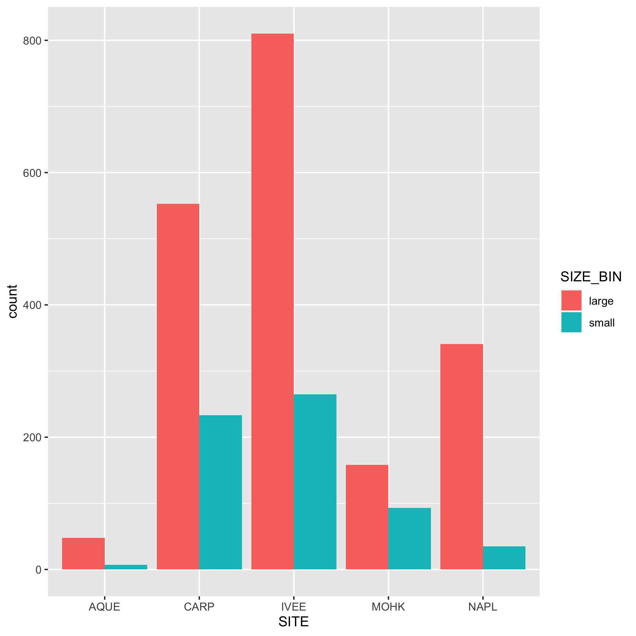
Create a bar graph that shows the amount of small and large sized carapace lobsters at each site from 2019-2021. Note: The small and large divisions are arbitrary here; the carapace size limit for catching and keeping lobster is 3.25 inches or about 82.5 mm.
First, let’s create a new dataset subset called lobster_size:
filter()for the years 2019, 2020, and 2021- Add a new column called
size_binthat contains the values “small” or “large”. A “small” carapace size is <= 70 mm, and a “large” carapace size is greater than 70 mm. Usemutate()andif_else(). Check your output - Calculate the number of “small” and “large” sized lobsters using
group()andsummarize(). Check your output - Remove the
NAvalues from the subsetted data. Hint: check outtidyr::drop_na(). Check your output
lobster_size <- lobster_abundance %>%
    filter(year %in% c(2019, 2020, 2021)) %>%
    mutate(size_bin = if_else(size_mm <= 70, true = "small", false = "large")) %>%
    group_by(site, size_bin) %>%
    summarize(count = n(), .groups = "drop") %>%
    drop_na()
Next, create a bar graph using ggplot2::ggplot() and ggplot2::geom_bar(). Note that geom_bar() automatically creates a stacked bar chart. Try using the argument position = "dodge" to make the bars side by side. Pick which bar position you like best.
# bar plot
ggplot(data = lobster_size, aes(x = site, y = n, fill = size_bin)) +
    geom_col()

# dodged bar plot
ggplot(data = lobster_size, aes(x = site, y = n, fill = size_bin)) +
    geom_col(position = "dodge")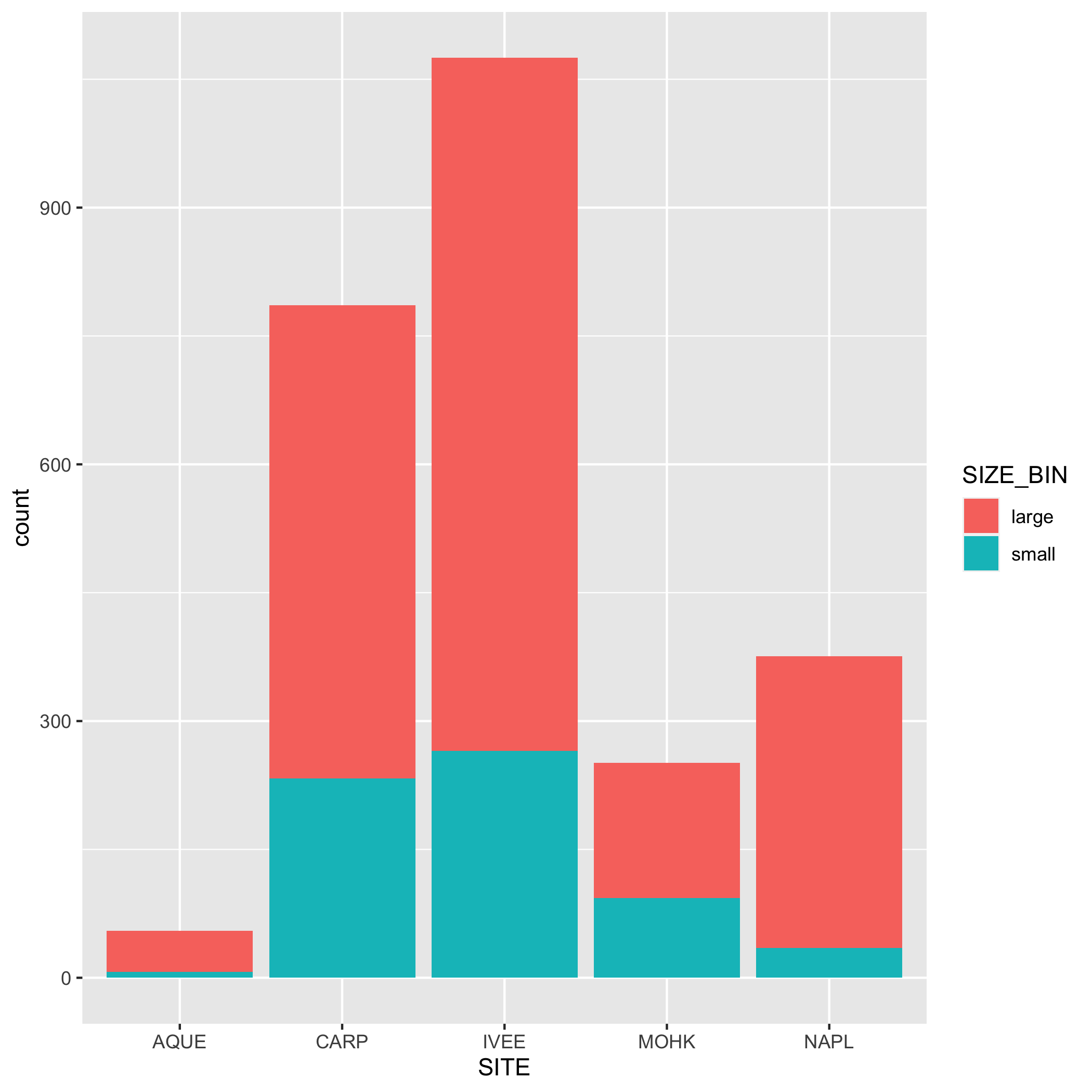
Setup
- Stay in the Quarto Document
collaborator_analysis.qmdand create a new section with a level 2 header and title it “Exercise: Data Visualization” - You should already have the
lobster_trapsdata frame in your environment from the previous exercises. If not, re-run the appropriate code chunk(s) to get the data frame back into your environment. Hooray reproducibility!
Visualization Exercises
Create a multi-panel plot of lobster commercial traps (traps) grouped by year, using ggplot2::ggplot(), ggplot2::geom_histogram(), and ggplot2::facet_wrap(). Use the variable year in facet_wrap(). Use the object lobster_traps.
ggplot(data = lobster_traps, aes(x = traps)) +
    geom_histogram() +
    facet_wrap( ~ year)
Create a line graph of the number of total lobster commercial traps observed (y-axis) by year (x-axis) in the study, grouped by site.
First, you’ll need to create a new dataset subset called lobsters_traps_summarize:
- Group the data by
siteANDyear - Calculate the total number of lobster commercial traps observed using
sum(). Look upsum()if you need to. Call the new columntotal_traps. Don’t forget aboutNAshere!
lobsters_traps_summarize <- lobster_traps %>%
  group_by(site, year) %>%
  summarize(total_traps = sum(traps, na.rm = TRUE),
            .groups = "drop")
Next, create a line graph using ggplot2::ggplot() and ggplot2::geom_line(). Use ggplot2::geom_point() to make the data points more distinct, but ultimately up to you if you want to use it or not. We also want site information on this graph, do this by specifying the variable in the color argument. Where should the color argument go? Inside or outside of aes()? Why or why not?
# line plot
ggplot(data = lobsters_traps_summarize, aes(x = year, y = total_traps)) +
    geom_line(aes(color = site))

# line and point plot
ggplot(data = lobsters_traps_summarize, aes(x = year, y = total_traps)) +
    geom_point(aes(color = site)) +
    geom_line(aes(color = site))

Create a bar graph that shows the amount of high and low fishing pressure of lobster commercial traps at each site from 2019-2021. Note: The high and low fishing pressure metrics are completely made up and are not based on any known facts.
First, you’ll need to create a new dataset subset called lobster_traps_fishing_pressure:
filter()for the years 2019, 2020, and 2021- Add a new column called
fishing_pressurethat contains the values “high” or “low”. A “high” fishing pressure has exactly or more than 8 traps, and a “low” fishing pressure has less than 8 traps. Usemutate()andif_else(). Check your output - Calculate the number of “high” and “low” observations using
group()andsummarize(). Check your output - Remove the
NAvalues from the subsetted data. Hint: check outtidyr::drop_na(). Check your output
lobster_traps_fishing_pressure <- lobster_traps %>%
    filter(year %in% c(2019, 2020, 2021)) %>%
    mutate(fishing_pressure = if_else(traps >= 8, true = "high", false = "low")) %>%
    group_by(site, fishing_pressure) %>%
    summarize(count = n(), .groups = "drop") %>%
    drop_na()
Next, create a bar graph using ggplot2::ggplot() and ggplot2::geom_bar(). Note that geom_bar() automatically creates a stacked bar chart. Try using the argument position = "dodge" to make the bars side by side. Pick which bar position you like best.
# bar plot
ggplot(data = lobster_traps_fishing_pressure, aes(x = site, y = count, fill = fishing_pressure)) +
    geom_col()

# dodged bar plot
ggplot(data = lobster_traps_fishing_pressure, aes(x = site, y = count, fill = fishing_pressure)) +
    geom_col(position = "dodge")

After you’ve completed the exercises or reached a significant stopping point, use the workflow: Stage (add) Commit Pull Push (and then make sure both partners sync with GitHub).
4 Customize your Visualizations
Now that you’ve created some basic data visualizations, let’s choose one plot to revisit your code and add styling code to it. For this exercise, only add styling code to the visualization you want to include in the lobster_report.qmd (if there’s time, feel free to add styling code to another plot). Explore the two tabs to find ways to customize the way data is displayed on your plot and the aesthetics/theme of the plot.
When you have customized your plot(s), save the final visualization(s) to the figs folder before collaborating on the lobster_report.qmd.
Some ggplot2 functions grant you control over the information displayed on your plot - labels, axis controls, and geometry arguments. This is far from a complete list!
labs(): modifying axis, legend and plot labelsscale_*_continuous(): use with continuous variables and update breaks, limits, and labelsscale_*_discrete(): use with discrete variables and update breaks, limits, and labelsscalespackage: use this within the above scale functions and you can do things like add percents to axes labelsgeom_()within a geom function you can modify:fill: updates fill colors (e.g. column, density, violin, & boxplot interior fill color)color: updates point & border line colors (generally)shape: update point stylealpha: update transparency (0 = transparent, 1 = opaque)size: point size or line widthlinetype: update the line type (e.g. “dotted”, “dashed”, “dotdash”, etc.)
aes() vs non-aes() arguments
- If you specify a variable name inside an
aes()call (e.g.,geom_line(aes(color = lobster_count))) maps that variable to an aesthetic (e.g. color, shape, size), and the legend is automatically generated.
- If you specify a color, shape, or size outside of
aes()(e.g.,geom_line(color = 'red')), it will apply that style to all points/geoms and no legend will be generated. - If you specify a variable name outside of
aes()(e.g.,geom_line(color = lobster_count)), R will look for an object with that name in your environment and will likely throw an error if it doesn’t find it!
The ggplot2 package includes some built-in themes (e.g., theme_minimal()) as well as many options for fine-tuning specific elements of the plot (e.g., changing the color and linewidth of the grid lines). Here are a few options and examples:
theme_xxx(): add a complete theme to your plot (e.g.,theme_light(),theme_minimal(),theme_void())- Note there are also several theme utility functions that might pop up with auto-complete, e.g.,
theme_get(),theme_set(),theme_update(),theme_replace()- these are not complete themes… if it sounds like a verb, not an adjective, it’s likely a theme utility function!
- Note there are also several theme utility functions that might pop up with auto-complete, e.g.,
theme(): call specific elements to customize non-data components of a plot. A few examples:
ggplot(...) +
geom_xxx(...) +
theme(axis.title = element_text(color = "blue", size = 14),
axis.title.y = element_text(angle = 45),
axis.text.x = element_blank(),
panel.background = element_rect(fill = "lightblue", color = 'red'),
panel.grid.major.y = element_line(color = "red", size = 0.5),
text = element_text(family = "Times New Roman"))- 1
- Change the axis title text color and size for both x and y
- 2
- Change the angle of the y-axis title text (note the hierarchical structure)
- 3
-
Remove x-axis text -
element_blank()will cancel any theme element - 4
- Change the panel background color and border
- 5
- Change the major grid lines on just the y axis
- 6
- Change the font family for all text in the plot
For a comprehensive list of all theme options, visit this reference: https://ggplot2.tidyverse.org/reference/theme.html
Once you’re happy with how your plot looks, assign it to an object, and save it to the figs directory using ggsave(), for example:
final_plot <- ggplot(...) +
geom_xxx() + ...
ggsave(filename = "figs/final_plot.png",
plot = final_plot,
width = 6, height = 4, dpi = 300)- 1
-
ggsavewill use the filename to determine the file type (e.g., .png, .jpg) - 2
-
ggsavedefaults to saving the most recently-generated plot, so you don’t necessarily need to specify theplotargument - 3
- options to specify the dimensions, resolution, units, etc. of the saved plot
Notice when you assign a plot to an object, Quarto will not display the generated plot in the rendered document unless you explicitly print it (e.g., print(final_plot) or just call the object itself (e.g., final_plot).
If you save the plot, you can display the saved image in your Quarto document using Markdown syntax (in a Markdown section of the document):
After you’ve completed the exercises or reached a significant stopping point, use the workflow: Stage (add) Commit Pull Push (and then make sure both partners sync with GitHub).
5 Challenge Yourself: MPAs! (optional)
Time permitting, we can add a new level of analysis by incorporating marine protected area (MPA) status.
The sites IVEE and NAPL are marine protected areas (MPAs). Add this status to your data set using a new function called dplyr::case_when(), which is like a multi-level if_else(). Then create some new plots using this new variable. Does it change how you think about the data? What new plots or analysis can you do with this new variable?
Use the object lobster_abundance and add a new column called status that contains “MPA” if the site is IVEE or NAPL, and “not MPA” for all other values.
lobster_mpa <- lobster_abundance %>%
mutate(status = case_when(site %in% c("IVEE", "NAPL") ~ "MPA",
site %in% c("AQUE", "CARP", "MOHK") ~ "not MPA",
TRUE ~ 'unknown'))- 1
-
The format for
case_wheniscase_when(condition1 ~ value1, condition2 ~ value2, ...). Conditions are evaluated in order, so a value will be assigned based on the first condition that isTRUE. - 2
-
Adding a final
TRUEtest ensures that anything that slips by the previous tests gets caught and assigned a value. Does it make a difference here?
Use the object lobster_traps and add a new column called status that contains “MPA” if the site is IVEE or NAPL, and “not MPA” for all other values.
lobster_traps_mpa <- lobster_traps %>%
mutate(status = case_when(site %in% c("IVEE", "NAPL") ~ "MPA",
site %in% c("AQUE", "CARP", "MOHK") ~ "not MPA",
TRUE ~ "unknown"))- 1
-
Again, we add a final
TRUEtest to catch any values that slip by the previous tests. Does it make a difference here?
5.1 Revisit Plots
Based on this new level of analysis, try to add status to your plots in some meaningful way. Consider using facet_wrap or adding status to one of the aesthetics using aes().
6 Collaborate on a Report
The final step! Time to work together again. Collaborate with your partner in lobster_report.qmd to create a report to publish to GitHub pages.
6.1 Report Elements
Make sure your Quarto Document is well organized and includes the following elements:
- Data summary
- Citation of the data
- Brief summary of the abstract (i.e. 1-2 sentences) from the EDI Portal
- Lobster abundance analysis and visualizations (Owner analysis)
- Lobster traps analysis and visualizations (Collaborator analysis)
- For each section of the analysis, choose one or more plots to include.
- Add plot(s) either with the data visualization code (including any subsetting code) or with Markdown syntax
- Decide whether you want to include the code or not, using code chunk options (e.g.,
#| echo). - Add alternative text to your plots (See Quarto Documentation)
- Include a paragraph describing the takeaways from the plot(s) you created.
6.2 Options for Collaboration
There are several ways to collaborate effectively here:
- Work together on a shared screen and talk through the code as you develop your
lobster_report.qmd- see pair programming below
- Work separately on your respective sections and then sync your work using Git and GitHub
- see lightweight code review below
- note, for this option, it might be helpful if one person outlines the structure using section headers, then both partners sync with Git/GitHub, to avoid both partners working in the same section and possibly creating a merge conflict.
- A combination of both! You can work together on the code for one portion of the report and then split out to work separately on other parts of the report.
As you’re working on the lobster_report.qmd consider two types of code reviews: (1) pair programming and (2) lightweight code review.
In pair programming, two people develop code together at the same workstation. One person is the “driver” and one person is the “navigator”. The driver writes the code while the navigator observes the code being typed, points out any immediate quick fixes, and will also Google / troubleshoot if errors occur. For this exercise, both the Owner and the Collaborator should experience both roles, so switch halfway through or at a meaningful stopping point.
In lightweight code review, the coder talks through the code they’ve developed, explaining the functionality to the collaborator. The collaborator provides feedback on code readability and logic and suggestions for improvement where applicable. For this exercise, the Owner and Collaborator should take turns explaining their code from their respective analysis.qmd as they add it to the lobster_report.qmd.
If you don’t have a collaborator, try explaining your code line by line to yourself or to an inanimate object (traditionally, a rubber duck - thus the term “rubber duck debugging” 🦆). You’ll be surprised at how much you can catch and improve just by talking through your code!
6.3 Wrapping Up
When the report is complete, make sure to Render the Quarto document. Rendering will run all the code in the document, in a clean environment (critical to ensure reproducibility!), and generate the formatted text and images for your report.
- If it renders successfully, you will see a new HTML file in the same directory as your
lobster_report.qmdfile.- Check that the report looks how you want it to look and that all the text, code, and visualization elements are there.
- If you need to make any changes, edit the .qmd and re-render until you’re happy with how it looks.
- Check that the report looks how you want it to look and that all the text, code, and visualization elements are there.
- If it doesn’t render successfully, you should get an error message that explains where the error is happening in your code.
- Use one of the code review strategies above to troubleshoot and fix the error.
- When you think have fixed the error, re-render the document and check that it looks how you want it to look.
After you’ve completed and successfully rendered your report, use the workflow: Stage (add) Commit Pull Push (and then make sure both partners sync with GitHub).
7 Bonus (optional): Publish using GitHub Pages
Finally, publish your beautiful report on GitHub pages (from Owner’s repository).
Owner navigates to the repository on GitHub (Note, collaborator may not have appropriate permissions). Then:
Choose Settings (upper right) and then Pages (lower left) to access the Pages tab.
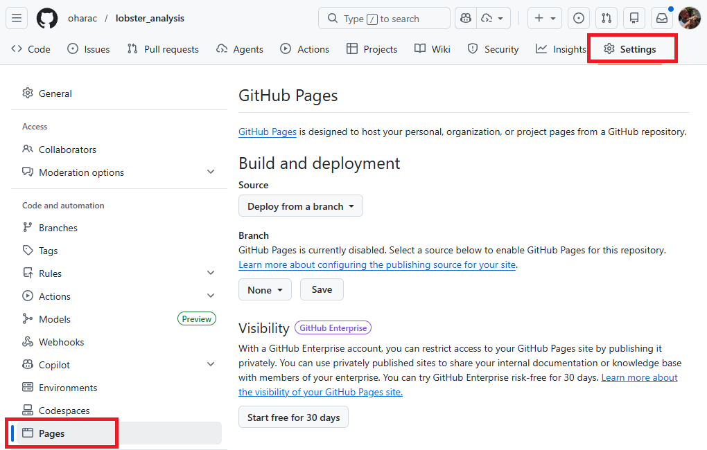
Under branch, click the button that says “None” and instead select “main”. A new button shows up reading /(root) - leave this default. Then click “Save”.
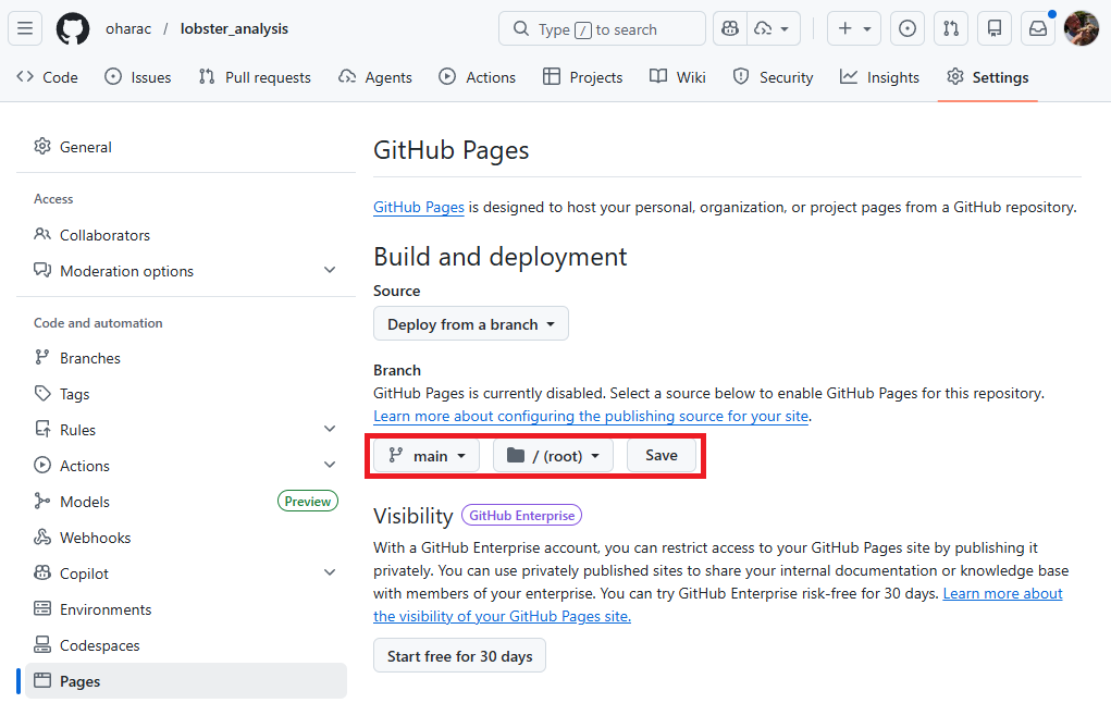
It takes a minute or two for the page to publish (or update, whenever you push changes). Refresh your browser window, and you should see a message saying “Your site is live at https://<github_username>.github.io/<repository_name>/” and a link to your page should be available: Visit site.
If you created a README in the initial setup of the repository, you should see that when you visit the site. To see your lobster report, you need to manually type it in: https://<github_username>.github.io/<repository_name>/lobster_report.html.
Together, Quarto and GitHub Pages make it super easy to share your work - we’ve only barely scratched the surface here!