library(readr)
library(dplyr)
library(tidyr)
library(forcats) # makes working with factors easier
library(ggplot2)
library(leaflet) # interactive maps
library(DT) # interactive tables
library(scales) # scale functions for visualization
library(janitor) # expedite cleaning and exploring data
library(viridis) # colorblind friendly color palette- Understand the fundamentals of how the
ggplot2package works - Use
ggplot2’sthemeand other customization functions create publication-grade graphics - Introduce the
leafletandDTpackage to create interactive maps and tables respectively
1 Overview
ggplot2 is a popular package for visualizing data in R. From the home page:
ggplot2is a system for declaratively creating graphics, based on The Grammar of Graphics. You provide the data, tellggplot2how to map variables to aesthetics, what graphical primitives to use, and it takes care of the details.
It’s been around for years and has pretty good documentation and tons of example code around the web (like on StackOverflow). The goal of this lesson is to explain the fundamentals of how ggplot2 work, introduce useful functions for customizing your plots and inspire you to go and explore this awesome resource for visualizing your data.
ggplot2 vs base graphics in R vs others
There are many different ways to plot your data in R. All of them work! However, ggplot2 excels at making complicated plots easy and easy plots simple enough
Base R graphics (plot(), hist(), etc) can be helpful for simple, quick and dirty plots. ggplot2 can be used for almost everything else.
Let’s dive into creating and customizing plots with ggplot2.
Make sure you’re in the right project (
training_{USERNAME}) and use theGitworkflow byPulling to check for any changes. Then, create a new Quarto document, delete the default text, and save this document.Load the packages we’ll need:
- Load the data directly from the EDI Data Repository: Sacramento-San Joaquin Delta Socioecological Monitoring. Navigate to the link above, scroll down and under Resources, click the “Download” button for the “Socioecological monitoring data”, and save or move it into a folder called
datain your repository (you might need to create the folder first). It saves as a file calledSocioecological_monitoring_data.csv
delta_visits_raw <- read_csv("data/Socioecological_monitoring_data.csv")Learn about the data. For this session we are going to be working with data on Socioecological Monitoring on the Sacramento-San Joaquin Delta. Check out the documentation.
Finally, let’s explore the data we just read into our working environment.
## Check out column names

colnames(delta_visits_raw)

## Peak at each column and class
glimpse(delta_visits_raw)

## From when to when
range(delta_visits_raw$Date)

## Which time of day?
unique(delta_visits_raw$Time_of_Day)
2 Getting the data ready
It is more frequent than not, that we need to do some wrangling before we can plot our data the way we want to. After reading and exploring our data, we’ll put our data wrangling skills to practice to get our data in the desired format.
janitor::clean_names() is an awesome function to transform all column names into the same format. The default format for this function is snake_case_format. We highly recommend having clear well formatted column names. It makes your life easier down the line.
How it works?
delta_visits <- delta_visits_raw %>%
    janitor::clean_names()
And that’s it! If we look to the column names of the object delta_visits we can see all the columns are in a lowercase, snake format.
colnames(delta_visits) [1] "eco_restore_approximate_location" "reach"
[3] "latitude" "longitude"
[5] "date" "time_of_day"
[7] "sm_boat" "med_boat"
[9] "lrg_boat" "bank_angler"
[11] "scientist" "cars"
[13] "notes" With the tidy data principles in mind. Is this data tidy?
- Every column is a variable.
- Every row is an observation.
- Every cell is a single value.
ggplot2 for the most part likes data input to be in a long format (aka “tidy”). So let go ahead and make this data frame long instead of wide. Do you remember the name of the function we can use?
Let’s refresh our memory on how this function works by accessing the help page. Type ?pivot_long() in the console to see the documentation for this function.
visits_long <- delta_visits %>%
    pivot_longer(cols = c(sm_boat, med_boat, lrg_boat, bank_angler, scientist, cars),
                 names_to = "visitor_type",
                 values_to = "quantity") %>%
    rename(restore_loc = eco_restore_approximate_location) %>%
    select(-notes)

## Checking the outcome
head(visits_long)
# A tibble: 6 × 8
restore_loc reach latitude longitude date time_of_day visitor_type
<chr> <chr> <dbl> <dbl> <date> <chr> <chr>
1 Decker Island Brannan … 38.1 -122. 2017-07-07 unknown sm_boat
2 Decker Island Brannan … 38.1 -122. 2017-07-07 unknown med_boat
3 Decker Island Brannan … 38.1 -122. 2017-07-07 unknown lrg_boat
4 Decker Island Brannan … 38.1 -122. 2017-07-07 unknown bank_angler
5 Decker Island Brannan … 38.1 -122. 2017-07-07 unknown scientist
6 Decker Island Brannan … 38.1 -122. 2017-07-07 unknown cars
# ℹ 1 more variable: quantity <dbl>3 Plotting with ggplot2
3.1 Essential components
First, we’ll cover some ggplot2 basics to create the foundation of our plot. Then, we’ll add on to make our great customized data visualization.
- Indicate we are using
ggplot()(call theggplot2::ggplot()function) - What data do we want to plot? (
data = my_data) - What are the mapping aesthetics? What variables do we want to plot? (define using
aes()function) - Define the geometry of our plot. This specifies the type of plot we’re making (use
geom_*()to indicate the type of plot e.g: point, bar, etc.)
Note To add layers to our plot, for example, additional geometries/aesthetics and theme elements or any ggplot object we use +.
Now, let’s plot total daily visits by restoration location. We will show this by creating the same plot in 3 slightly different ways. Each of the options below have the 4 essential pieces of a ggplot.
## Option 1 - data and mapping called in the ggplot() function
ggplot(data = daily_visits_loc,
       aes(x = restore_loc, y = daily_visits)) +
    geom_col()


## Option 2 - data called in ggplot function; mapping called in geom
ggplot(data = daily_visits_loc) +
    geom_col(aes(x = restore_loc, y = daily_visits))


## Option 3 - data and mapping called in geom
ggplot() +
    geom_col(data = daily_visits_loc,
             aes(x = restore_loc, y = daily_visits))
They all will create the same plot:
(Apologies for the jumbled text on the x-axis, we will learn how to make this look better soon)
ggplot(data = daily_visits_loc,
       aes(x = restore_loc, y = daily_visits)) +
    geom_col()
3.2 Looking at different geoms_*
Having the basic structure with the essential components in mind, we can easily change the type of graph by updating the geom_*().
ggplot2 and the pipe operator
Just like in dplyr and tidyr, we can also pipe a data.frame directly into the first argument of the ggplot function using the %>% operator.
This can certainly be convenient, but use it carefully! Combining too many data-tidying or subsetting operations with your ggplot call can make your code more difficult to debug and understand.
We will use the pipe operator to pass into ggplot() a filtered version of daily_visits_loc, and make a plot with different geometries.
Boxplot Note: These examples are to demonstrate case uses of wrangling function prior to plotting. They are not necessarily plotting best practices.
daily_visits_loc %>%
    separate(date, c("year", "month", "day"), sep = "-") %>%
    filter(daily_visits < 30,
           visitor_type %in% c("sm_boat", "med_boat", "lrg_boat")) %>%
    ggplot(aes(x = visitor_type, y = daily_visits)) +
    geom_boxplot()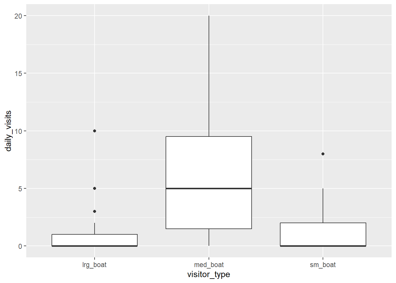
Violin plot
daily_visits_loc %>%
    separate(date, c("year", "month", "day"), sep = "-") %>%
    filter(daily_visits < 30,
           visitor_type %in% c("sm_boat", "med_boat", "lrg_boat")) %>%
    ggplot(aes(x = visitor_type, y = daily_visits)) +
    geom_violin()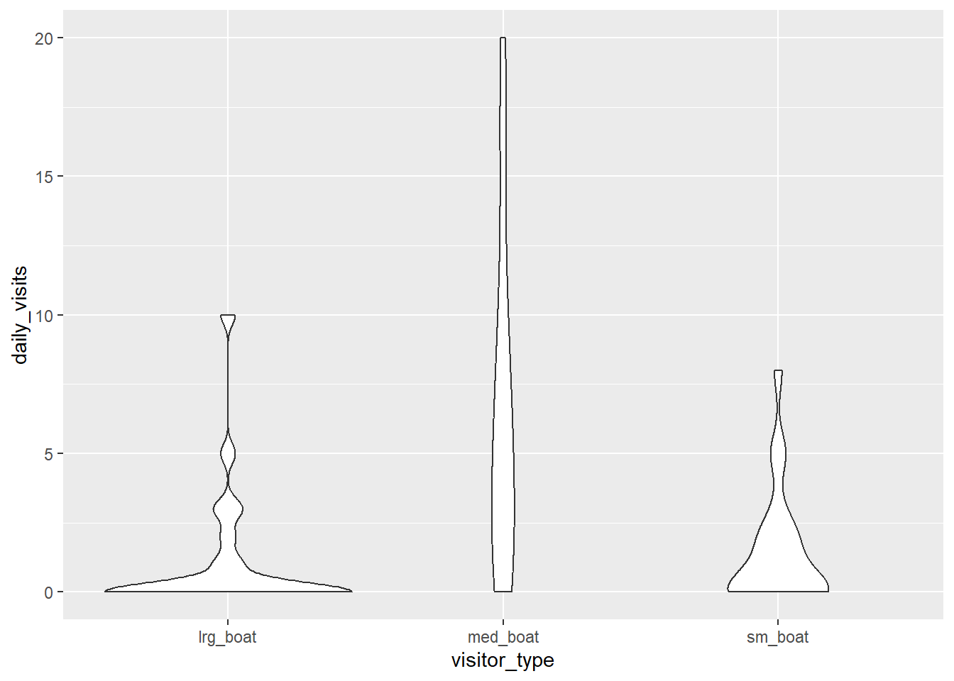
Line and point
daily_visits_loc %>%
    filter(restore_loc == "Decker Island",
           visitor_type == "med_boat") %>%
    ggplot(aes(x = date, y = daily_visits)) +
    geom_line() +
    geom_point()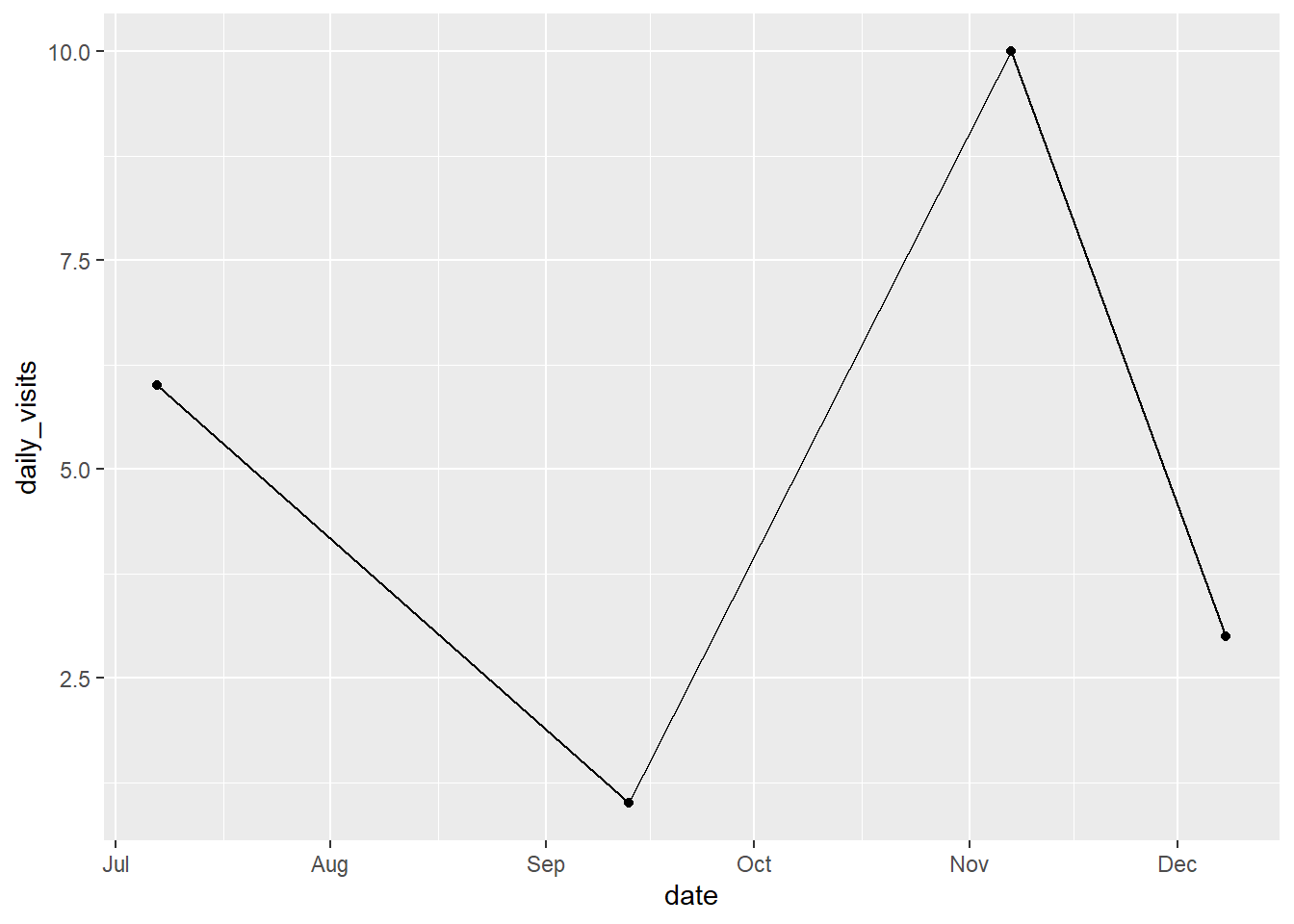
3.3 Customizing our plot
Let’s go back to our base bar graph. What if we want our bars to be blue instead of gray? You might think we could run this:
ggplot(data = daily_visits_loc,
       aes(x = restore_loc, y = daily_visits,
           fill = "blue")) +
    geom_col()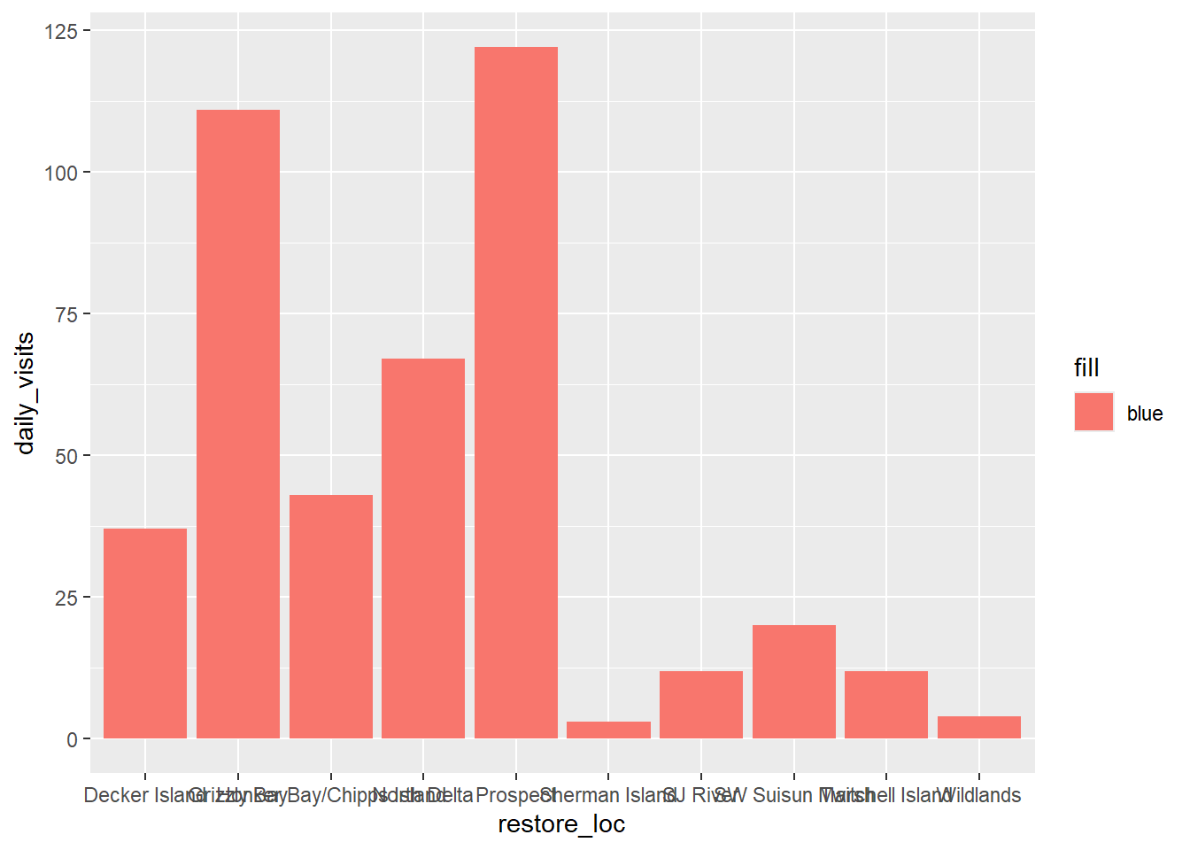
Why did that happen?
Notice that we tried to set the fill color of the plot inside the mapping aesthetic call. What we have done, behind the scenes, is create a column filled with the word “blue” in our data frame, and then mapped it to the fill aesthetic, which then chose the default fill color, salmon.
What we really wanted to do was just change the color of the bars. If we want do do that, we can call the color option in the geom_col() function, outside of the mapping aesthetics function call.
ggplot(data = daily_visits_loc,
       aes(x = restore_loc, y = daily_visits)) +
    geom_col(fill = "blue")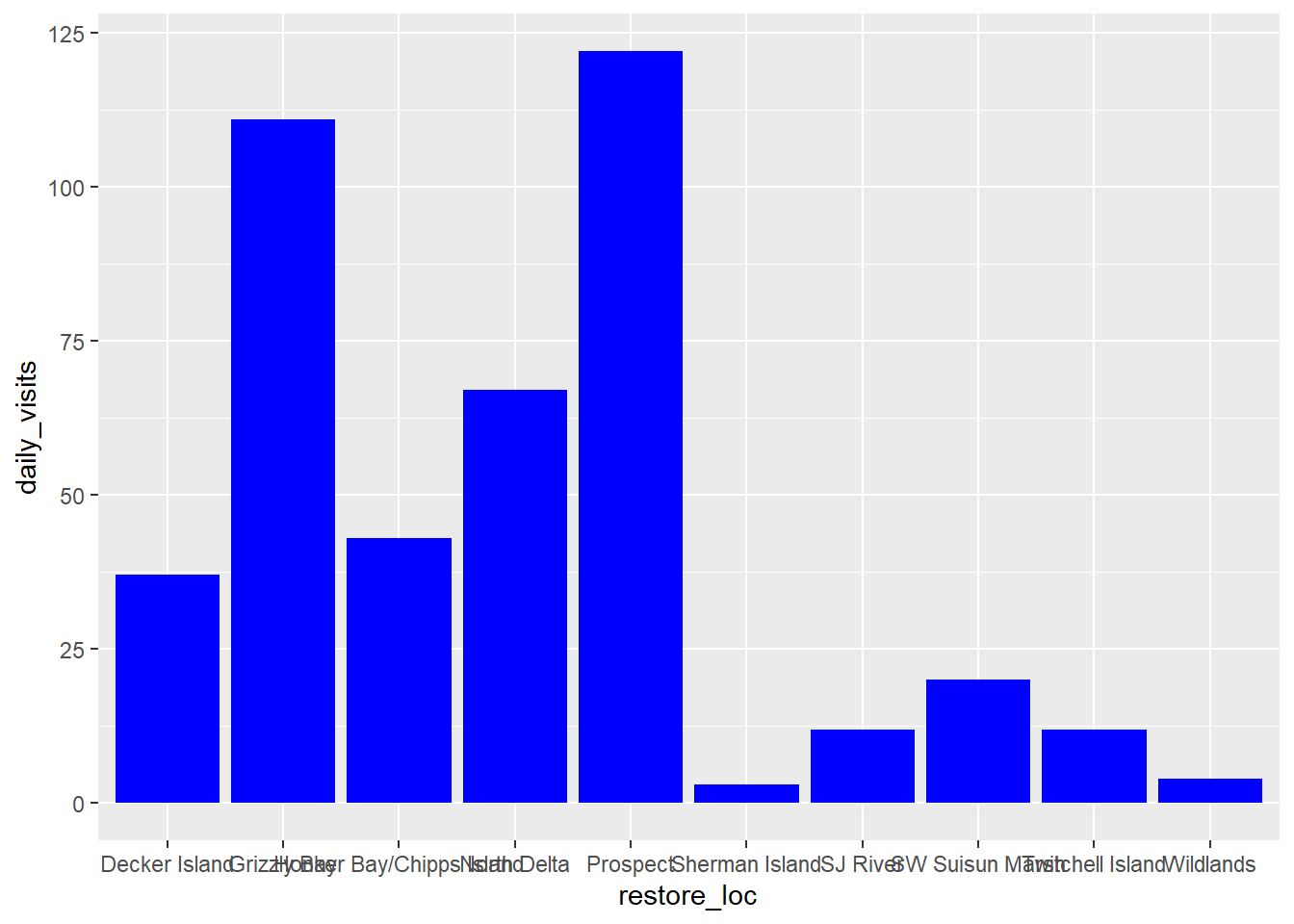
What if we did want to map the color of the bars to a variable, such as visitor_type. ggplot() is really powerful because we can easily get this plot to visualize more aspects of our data.
ggplot(data = daily_visits_loc,
       aes(x = restore_loc, y = daily_visits,
           fill = visitor_type)) +
    geom_col()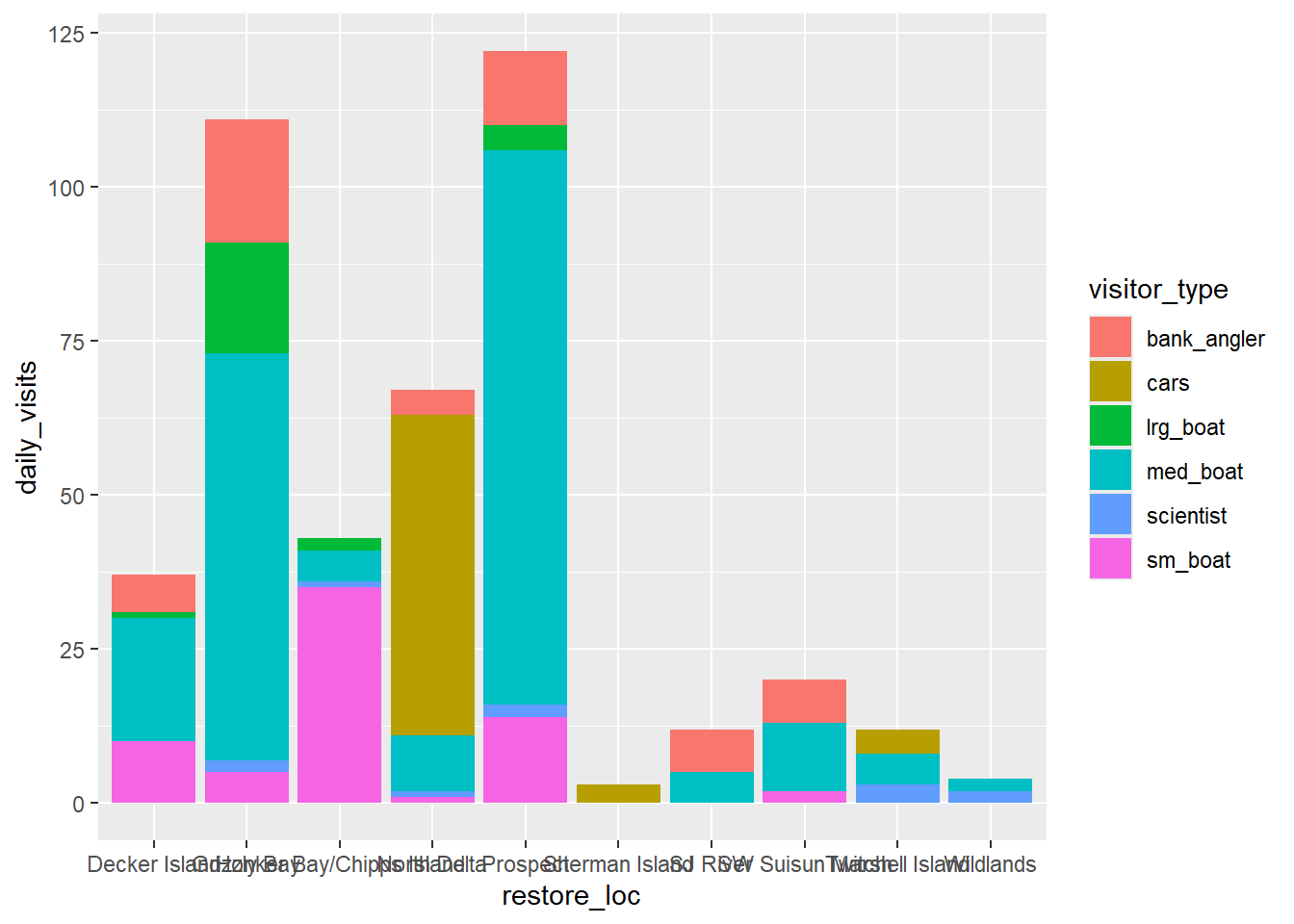
If you want to map a variable onto a graph aesthetic (e.g., point color should be based on a specific region), put it within
aes().If you want to update your plot base with a constant (e.g. “Make ALL the points BLUE”), you can add the information directly to the relevant
geom_layer outside theaes()call.
3.3.1 Setting ggplot themes
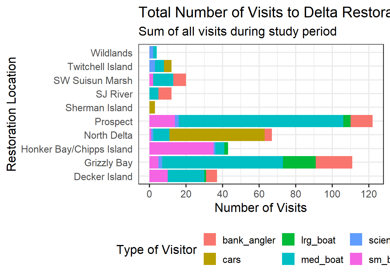
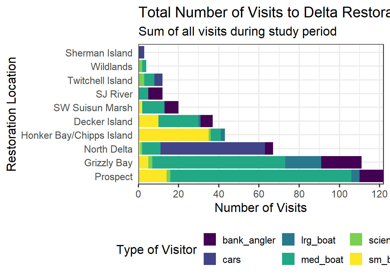
We have successfully plotted our data. But, this is clearly not a nice plot. Let’s work on making this plot look a bit nicer. We are going to:
- Add a title, subtitle and adjust labels using
labs() - Flip the x and y axis to make it a sideways column plot and make the labels easier to read
- Include a built in theme using
theme_bw()
ggplot(data = daily_visits_loc,
       aes(y = restore_loc, x = daily_visits, fill = visitor_type)) +
    geom_col() +
    labs(x = "Number of Visits",
         y = "Restoration Location",
         fill = "Type of Visitor",
         title = "Total Number of Visits to Delta Restoration Areas by visitor type",
         subtitle = "Sum of all visits during July 2017 and March 2018") +
    theme_bw()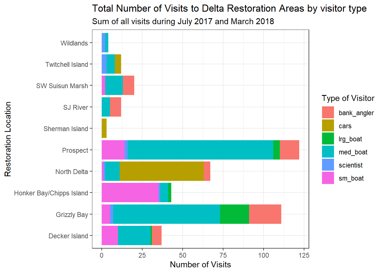
You can see that the theme_bw() function changed a lot of the aspects of our plot! The background is white, the grid is a different color, etc. There are lots of other built in themes like this that come with the ggplot2 package that help quickly set the look of the plot. Use the RStudio auto-complete theme_ <TAB> to view a list of theme functions.
## Useful baseline themes are
theme_minimal()
theme_light()
theme_classic()
The built in theme functions (theme_*()) change the default settings for many elements that can also be changed individually using thetheme() function. The theme() function is a way to further fine-tune the look of your plot. This function takes MANY arguments (just have a look at ?theme). Luckily there are many great ggplot resources online so we don’t have to remember all of these, just Google “ggplot cheat sheet” and find one you like.
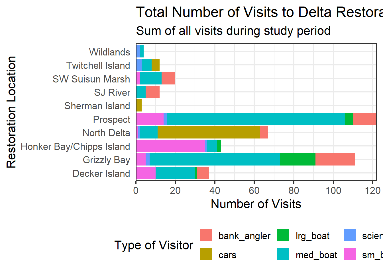
Let’s look at an example of a theme() call, where we change the position of the legend from the right side to the bottom, and remove the ticks of our Locations axis.
ggplot(data = daily_visits_loc,
       aes(y = restore_loc, x = daily_visits, fill = visitor_type)) +
    geom_col() +
    labs(x = "Number of Visits",
         y = "Restoration Location",
         fill = "Type of Visitor",
         title = "Total Number of Visits to Delta Restoration Areas by visitor type",
         subtitle = "Sum of all visits during study period") +
    theme_bw() +
    theme(legend.position = "bottom",
axis.ticks.y = element_blank()) 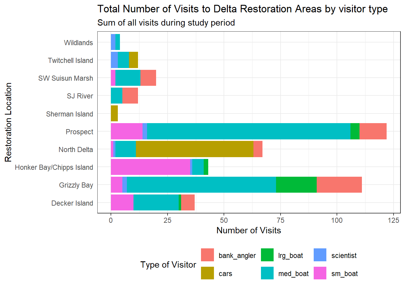
Note that the theme() call needs to come after any built-in themes like theme_bw() are used. Otherwise, theme_bw() will likely override any theme elements that you changed using theme().
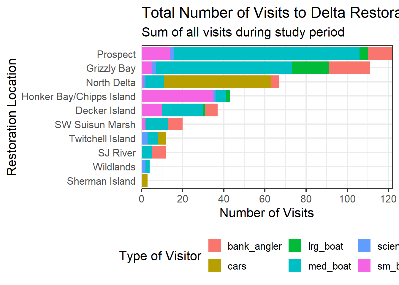
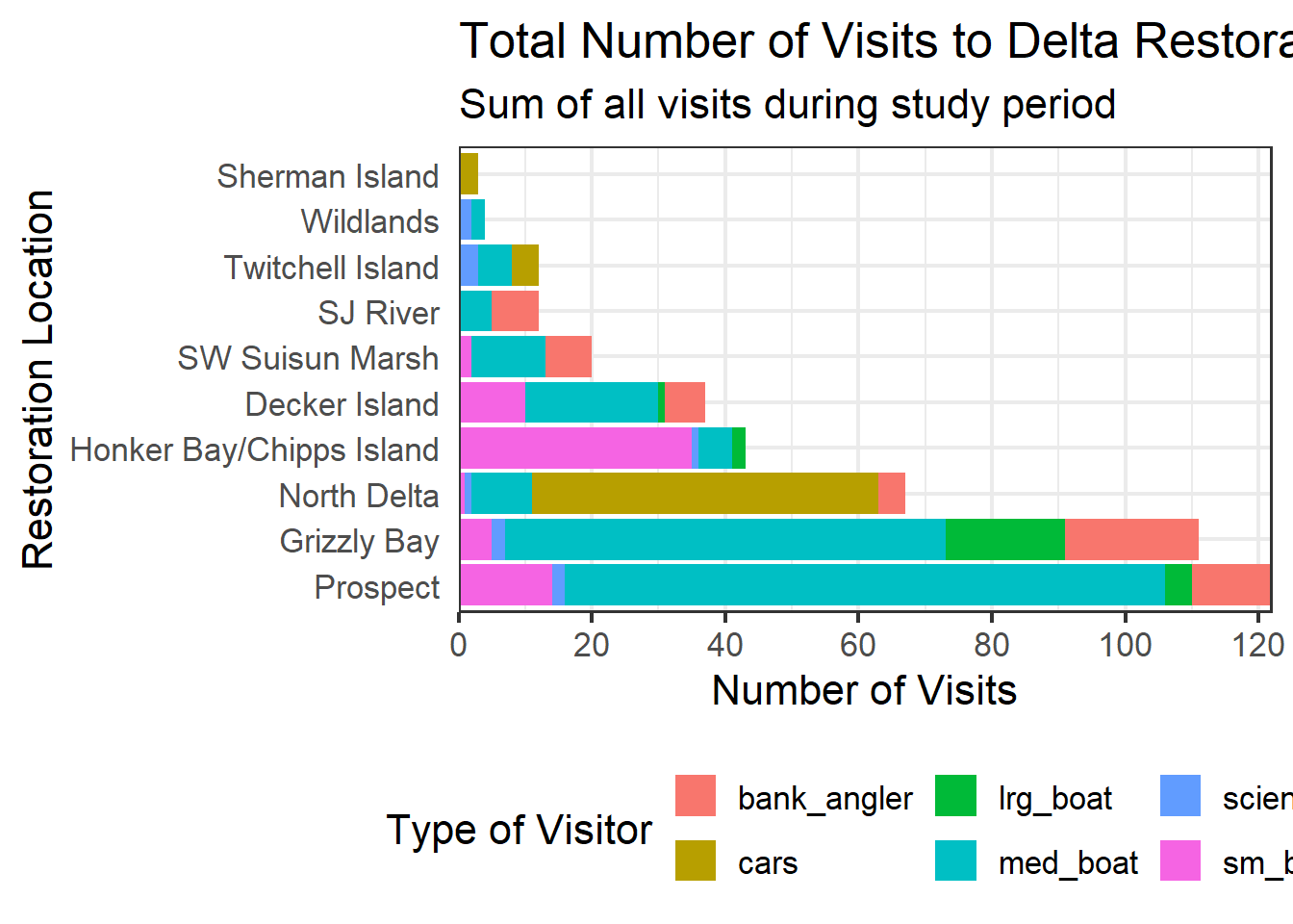
You can also save the result of a series of theme() function calls to an object to use on multiple plots. This prevents needing to copy paste the same lines over and over again!
my_theme <- theme_bw(base_size = 16) +
    theme(legend.position = "bottom",
          axis.ticks.y = element_blank())
So now our code will look like this:
ggplot(data = daily_visits_loc,
       aes(y = restore_loc, x = daily_visits, fill = visitor_type)) +
    geom_col() +
    labs(x = "Number of Visits",
         y = "Restoration Location",
         fill = "Type of Visitor",
         title = "Total Number of Visits to Delta Restoration Areas by visitor type",
         subtitle = "Sum of all visits during study period") +
    my_theme
